
When I first heard about indoor positioning, I thought it was just like GPS, but indoors—no big deal, right? Well, I was so wrong. The client’s vision was much more exciting:
- Real-time tracking of multiple people inside a venue.
- Adding social features like messaging, friend requests, and even group games.
This felt like something out of a sci-fi movie, so I dove deep into research. That’s when I discovered IndoorAtlas, a platform that uses geomagnetic fields for indoor tracking. It even offered tools for deploying custom apps for specific venues.
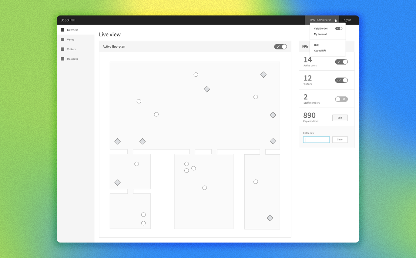
We pitched the idea of a Control Panel to help venue owners monitor foot traffic in real time, and the client loved it.
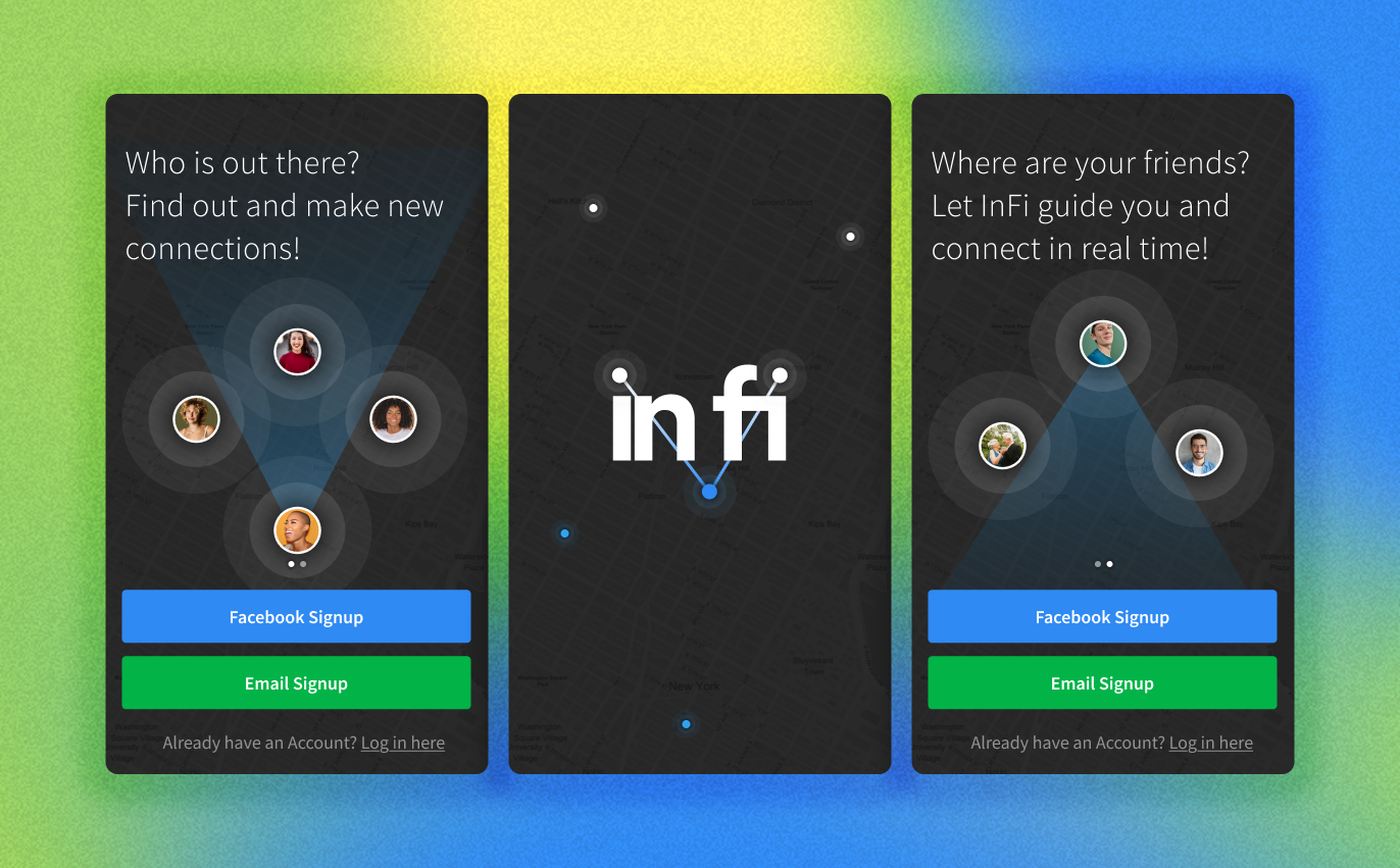
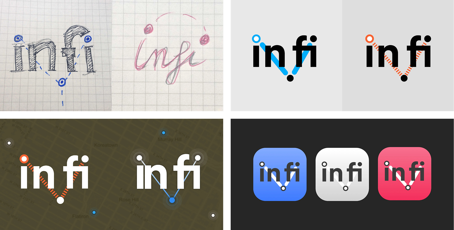
Workshops, brainstorming, and user research sessions helped us shape the app’s identity. We called it inFi, inspired by “indoor” + “fidelity.”
And since the client was a big FC Bayern fan, the very first non-negotiable request was that we used their iconic colors for the branding, while the rest was inspired by maps and navigation softwares iconography.
We wanted inFi to be the ultimate companion for anyone exploring airports, museums, or conference halls for the first time. To get there, we focused on three big things:
Building Personas & User Flows
We imagined how different people would use inFi and sketched out their journeys, like:
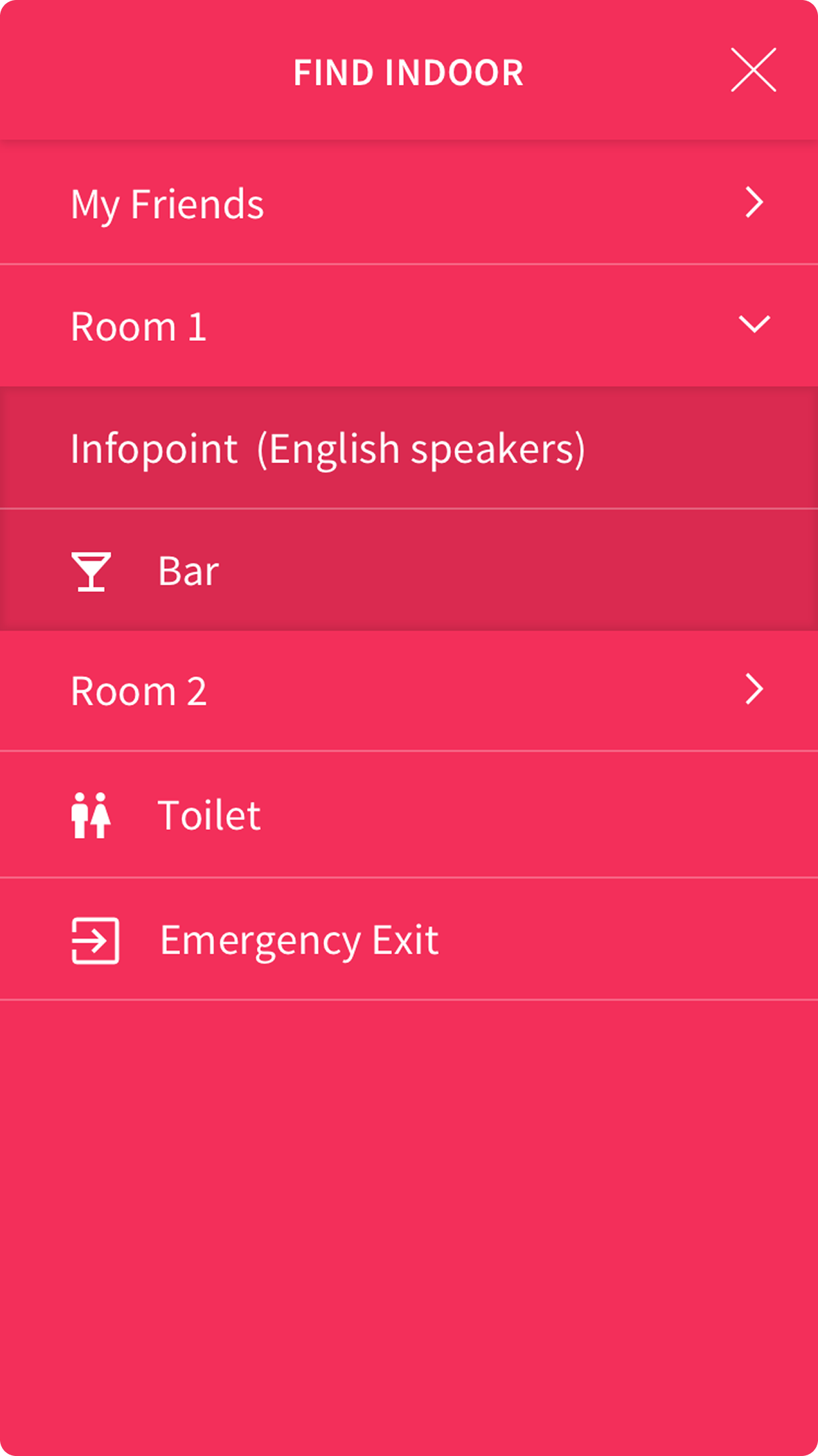
- Finding their way using indoor maps.
- Checking into venues.
- Exploring points of interest (POIs).
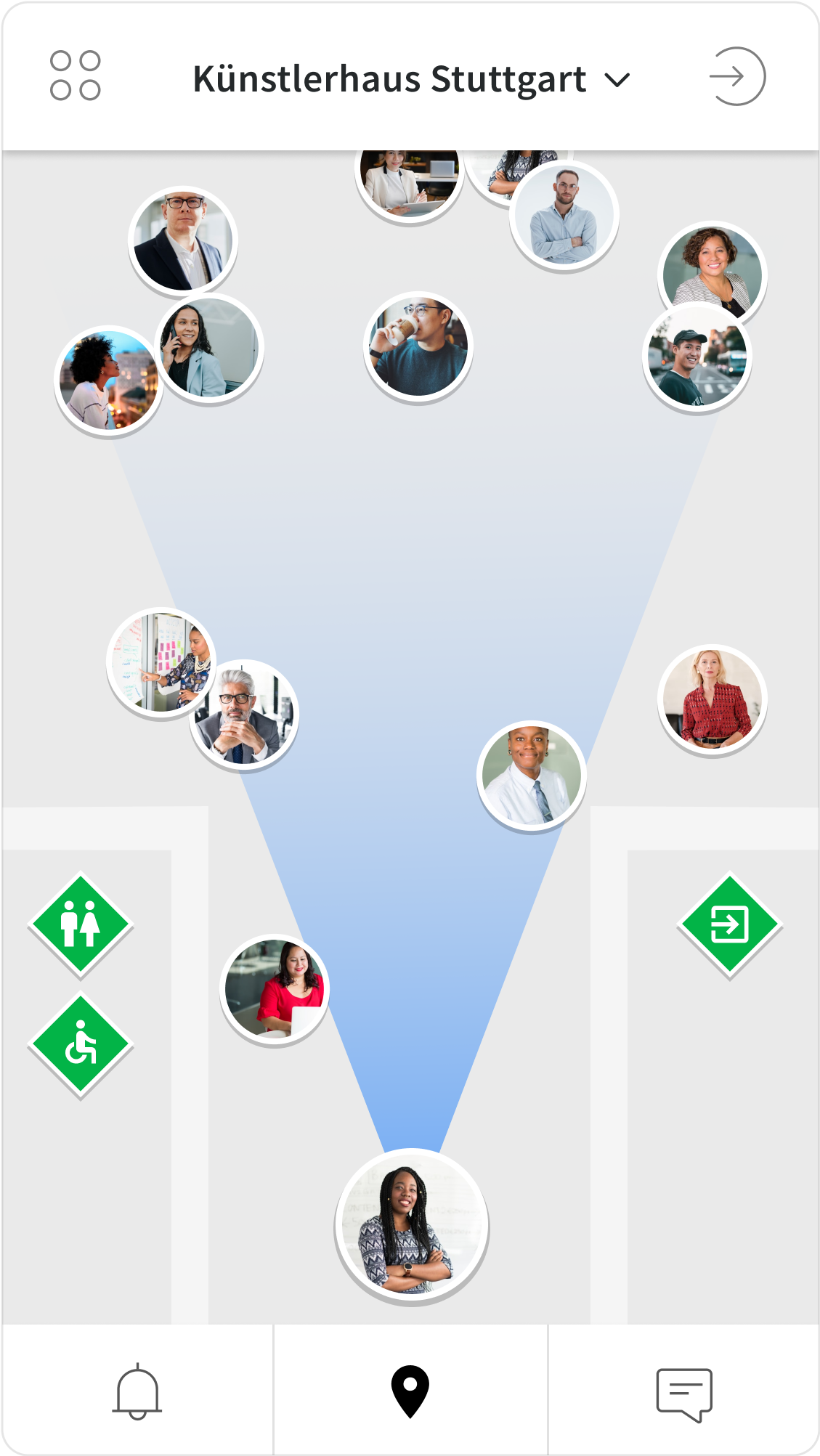
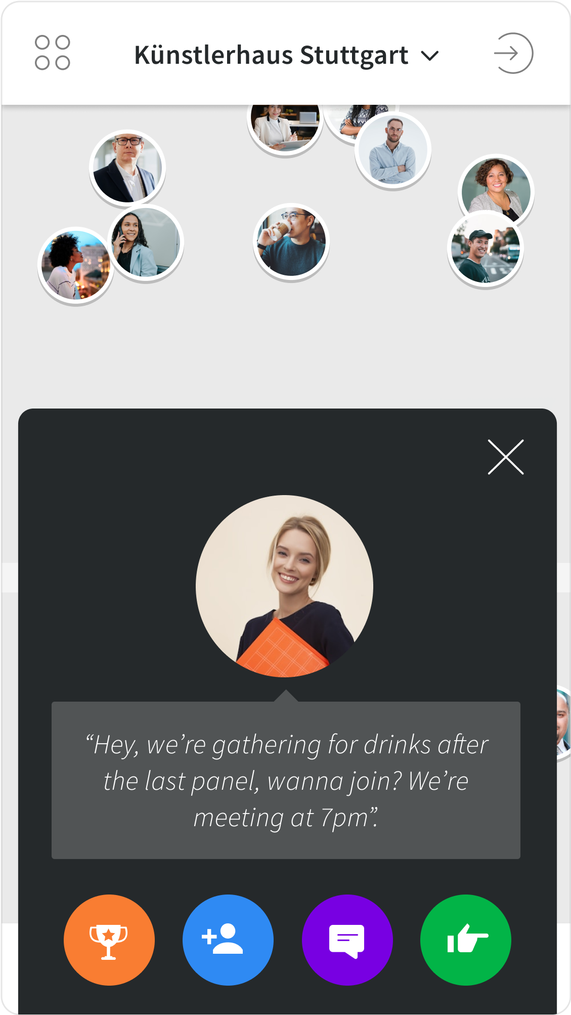
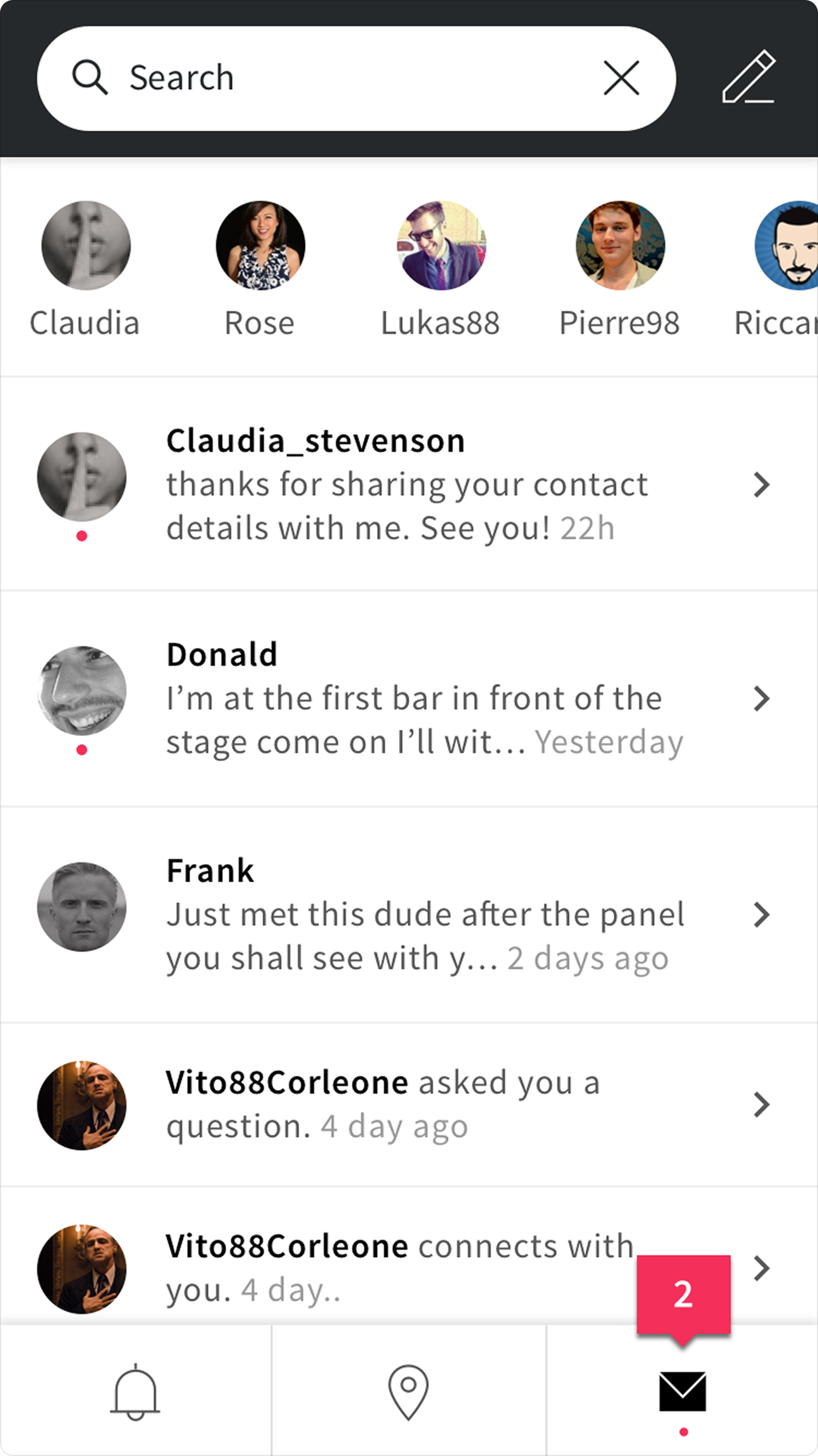
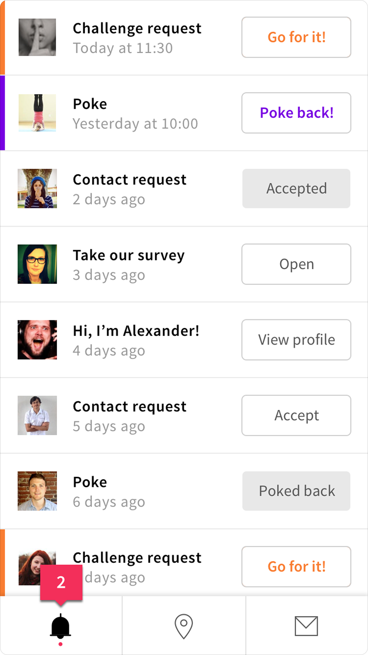
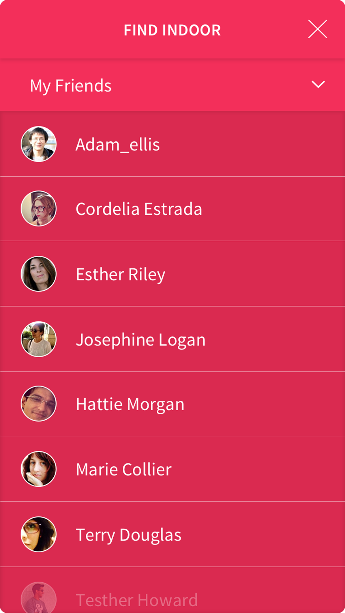
- Seeing nearby users and connecting with them.
Handling Privacy the Right Way
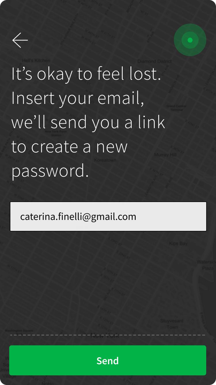
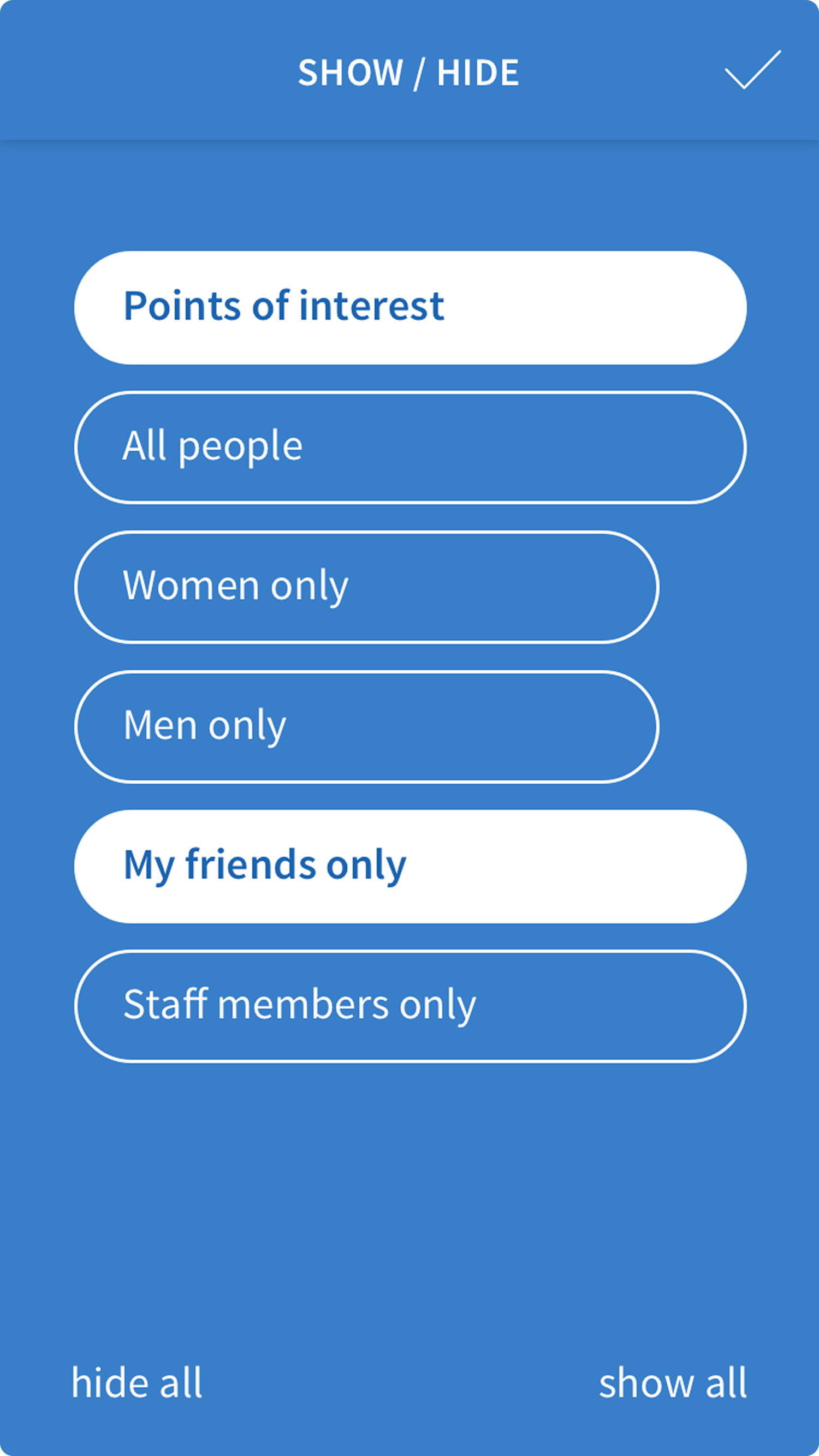
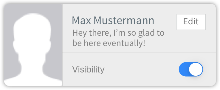
Privacy was a huge concern. We didn’t want it to feel like a creepy “Big Brother” app where admins could spy on everyone. Instead, I came up with a mutual visibility switch: you can only see someone’s location if they’ve shared theirs with you. It created trust and gave users control.
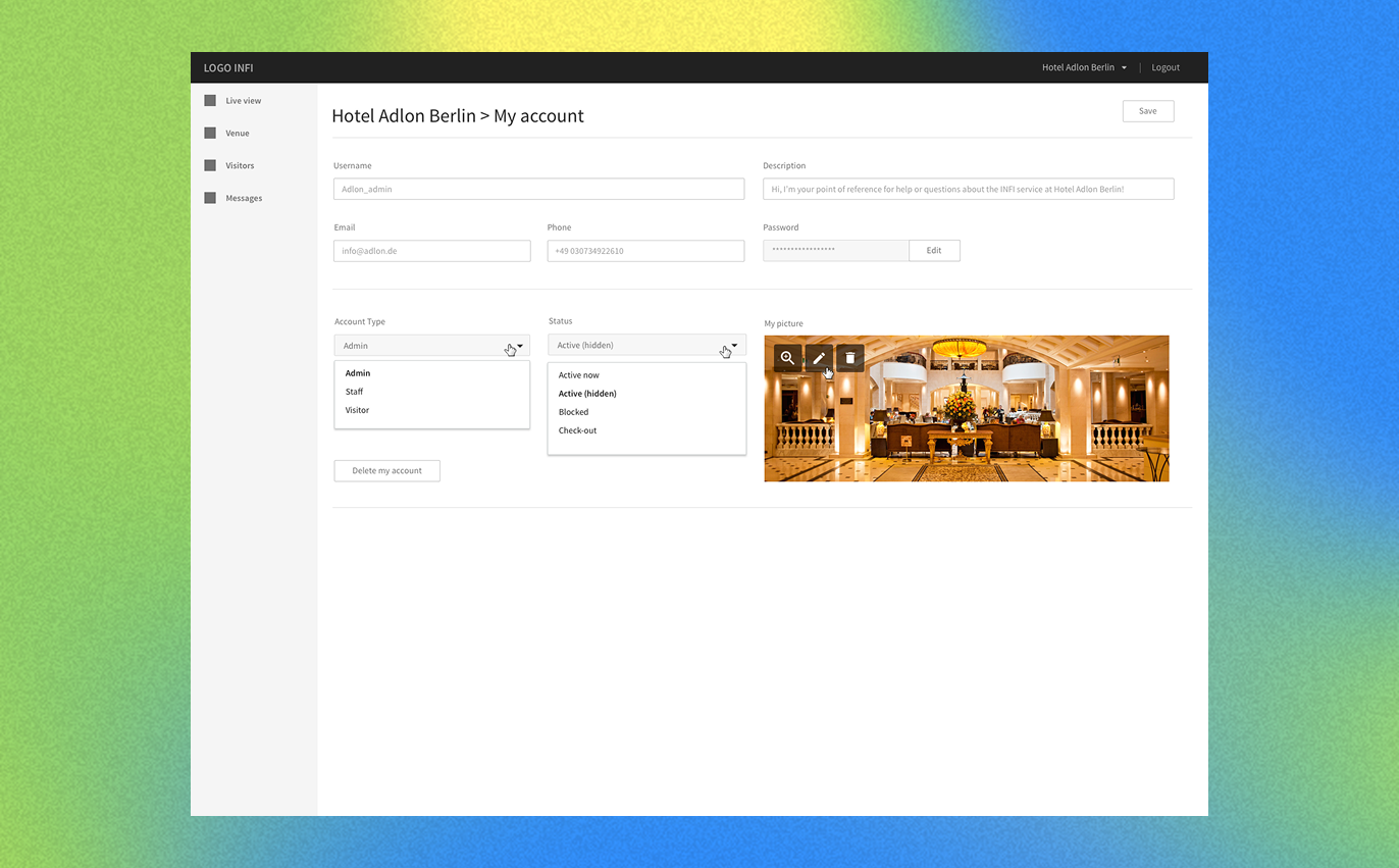
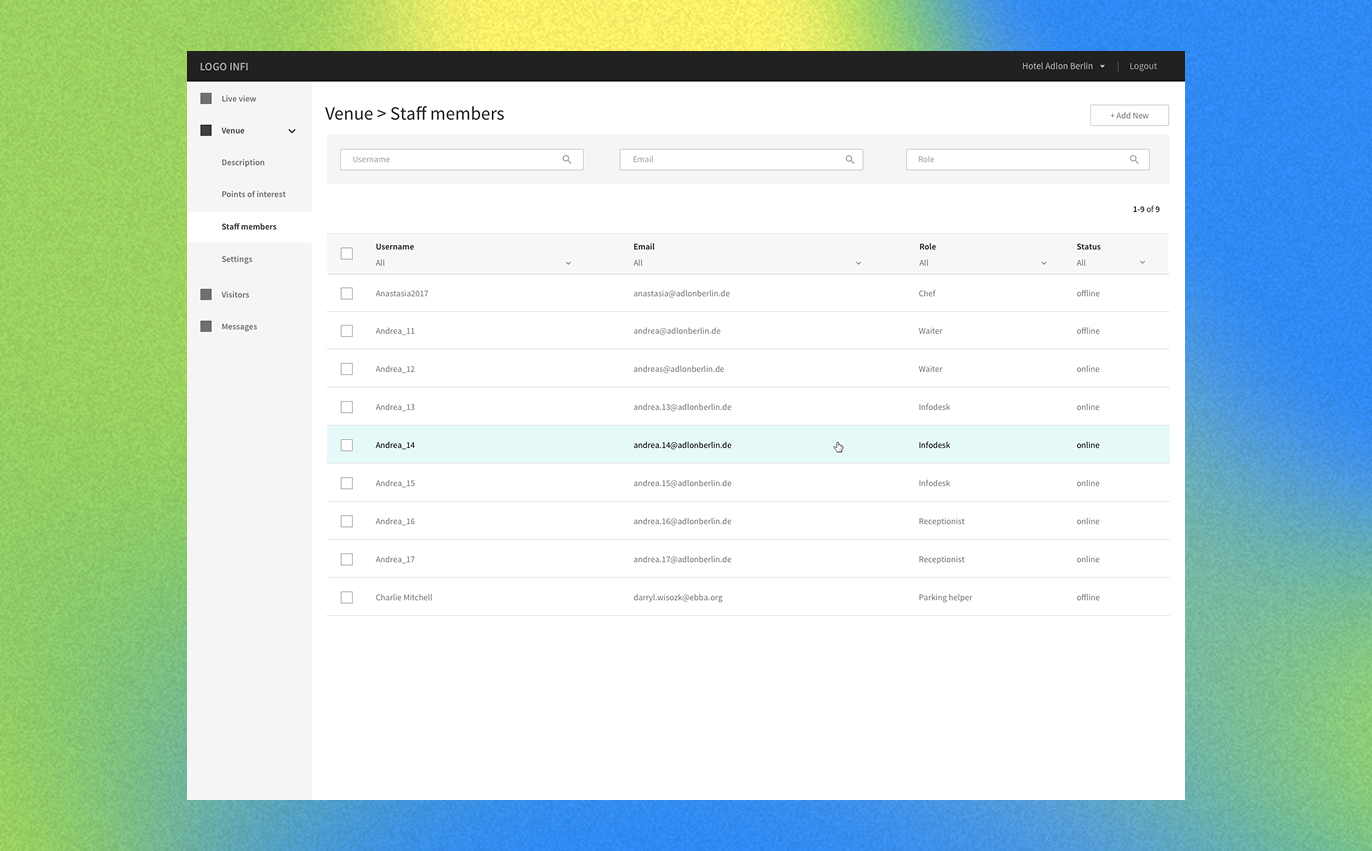
Keeping Admins Happy Too
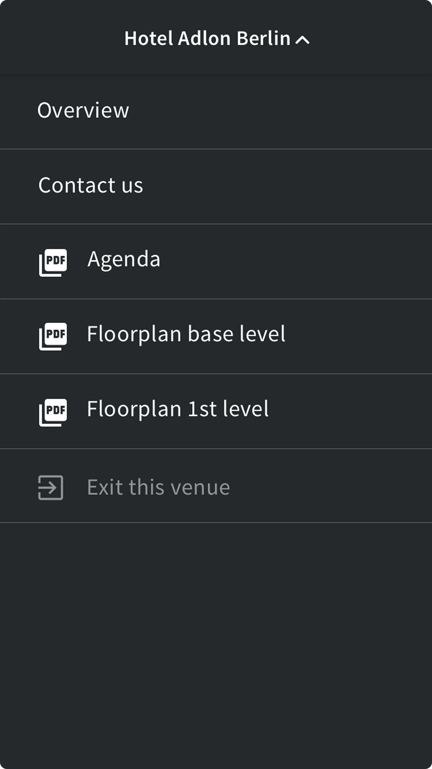
For venue admins, we designed tools to make their lives easier, like:
- Sending bulk messages.
- Viewing real-time traffic on floor plans.
This way, we made sure both users and admins got what they needed.
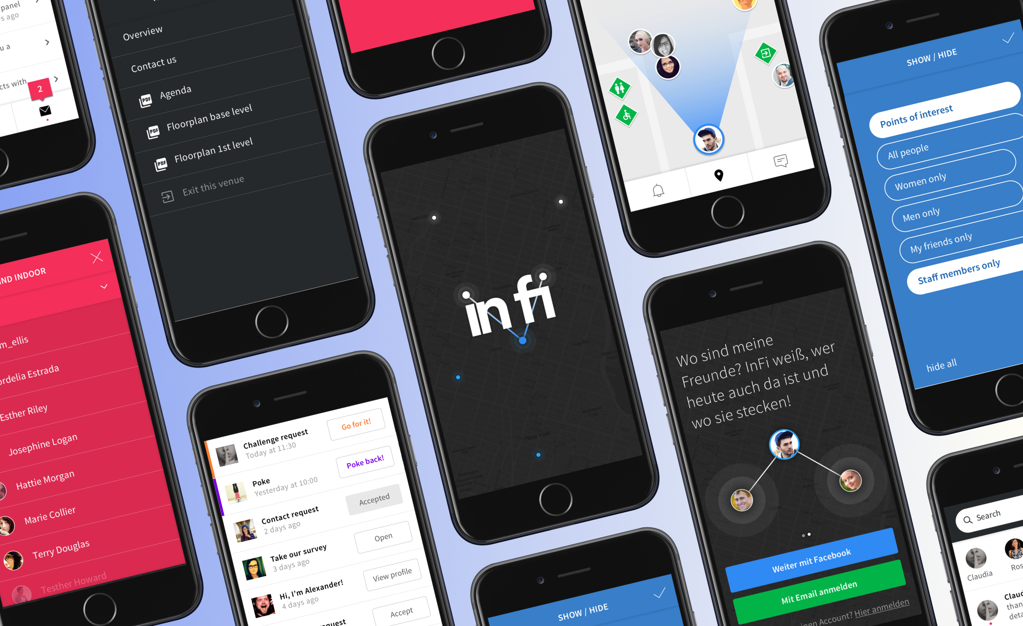
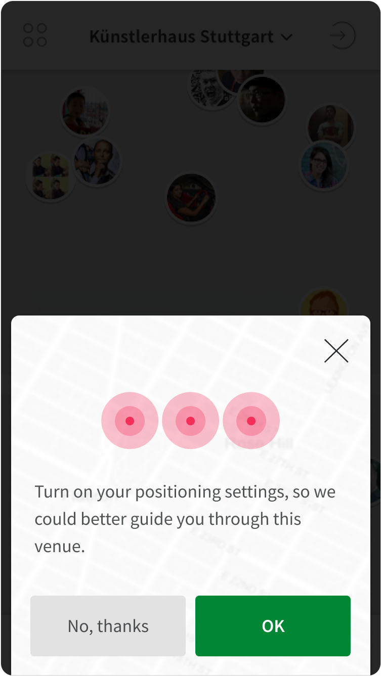
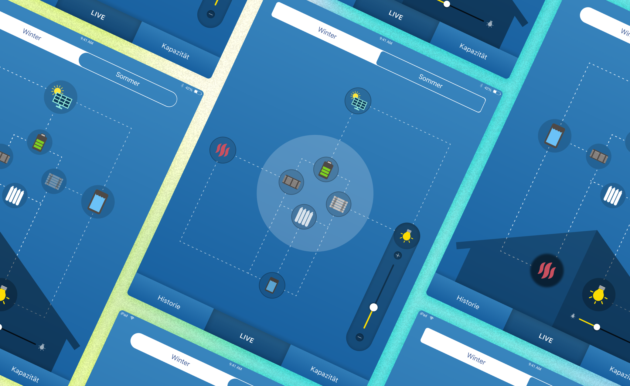
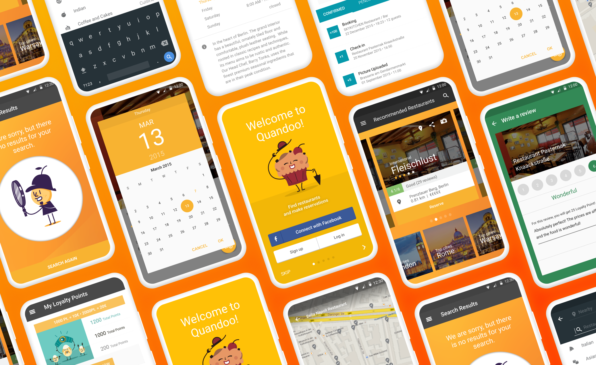
Here are a few initial wireframes:
Here’s where the fun really started—turning our ideas into something we could actually test.
I started with low-fi wireframes, keeping everything simple. This let us focus on how things worked, not just how they looked. Mapping out interactions and catching errors early saved us tons of time later.
Since we were using IndoorAtlas, we chose the Ionic Framework for the app—it’s perfect for building cross-platform solutions. For the admin side, we went with the Foundation Framework to keep things stable and responsive.
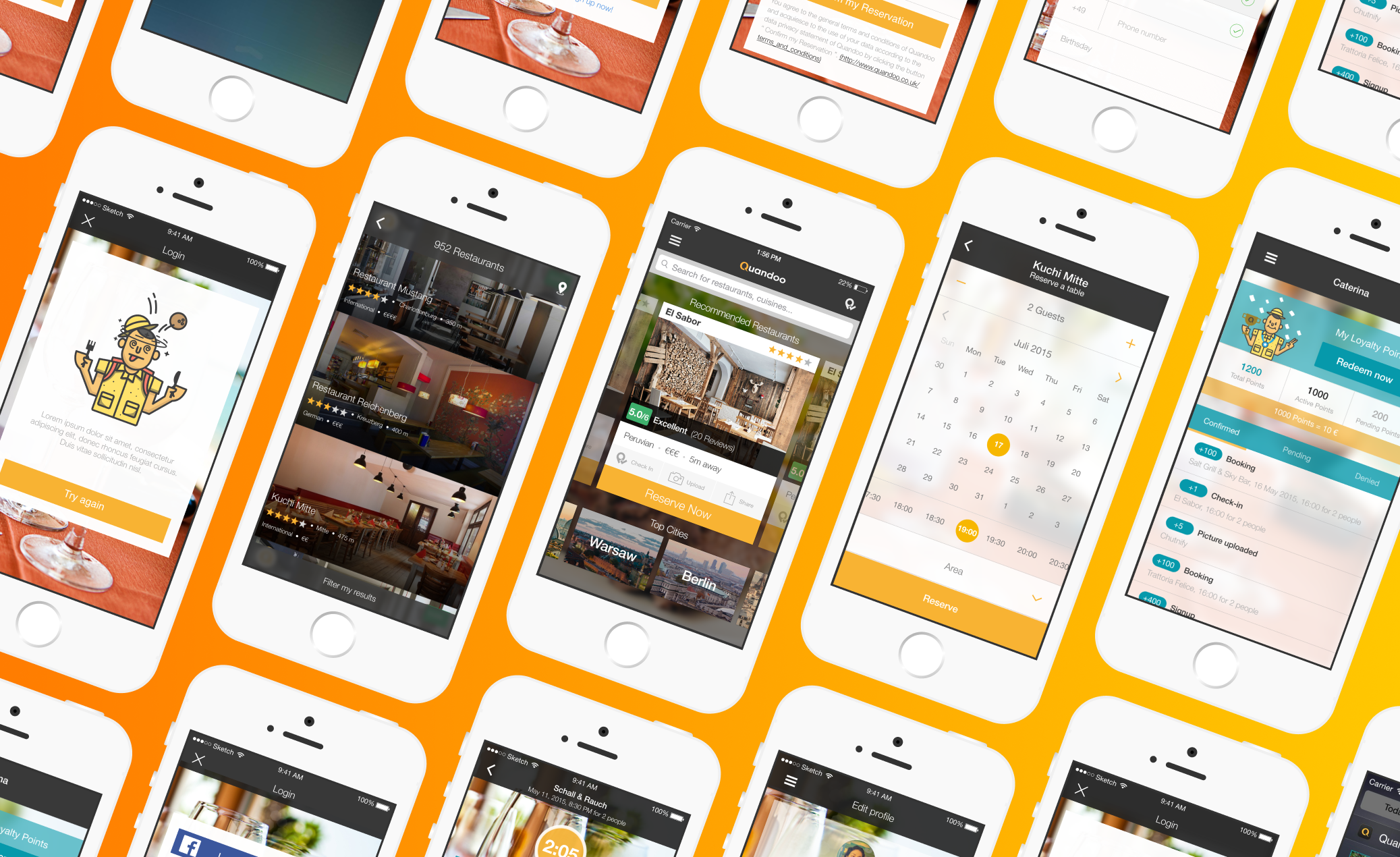
Using Figma, I created clickable prototypes. We handed them to stakeholders to play around with on their devices. The feedback was super helpful for refining the design and fixing any hiccups.
User testing was key to making inFi something people would actually want to use. Here’s how we approached it:
We brought in people to test the app in realistic scenarios, like navigating an airport or exploring a museum. Here’s what we learned:
- Navigation was mostly intuitive, but first-time users needed clearer onboarding.
- The mutual visibility switch was a hit—it made people feel in control and safe.
- Fun touches like the proximity compass made the app feel more engaging.
A/B Testing
We also tested different versions of key features, like how to guide users to Points of Interest (POIs). The results? Minimalist cues and helpful text worked best, boosting success rates by 23%.
Iterating on Feedback
We took everything we learned and made changes. For example:
- Adjusting font sizes to make them readable in dimly lit venues.
- Adding tooltips to make admin features easier to learn.

inFi was a tricky balance—it had to be both a navigation tool and a social app.
Gamifying the Experience
We added playful touches to make it fun, like:
- Proximity compasses for nearby users.
- Navigation elements inspired by dating apps (yes, swiping works for more than just matchmaking!).
Keeping It Simple
I followed Steve Krug’s golden rule: “Don’t make me think.” Everything—from colors to button placement—was designed to feel intuitive. If you didn’t have to stop and think, I knew I did my job right.
Polishing the Details
We took inspiration from FPS games to offer users familiar views, like:
- First-person perspectives.
- Bird’s-eye layouts.
This mix of familiarity and innovation made the app feel just right.
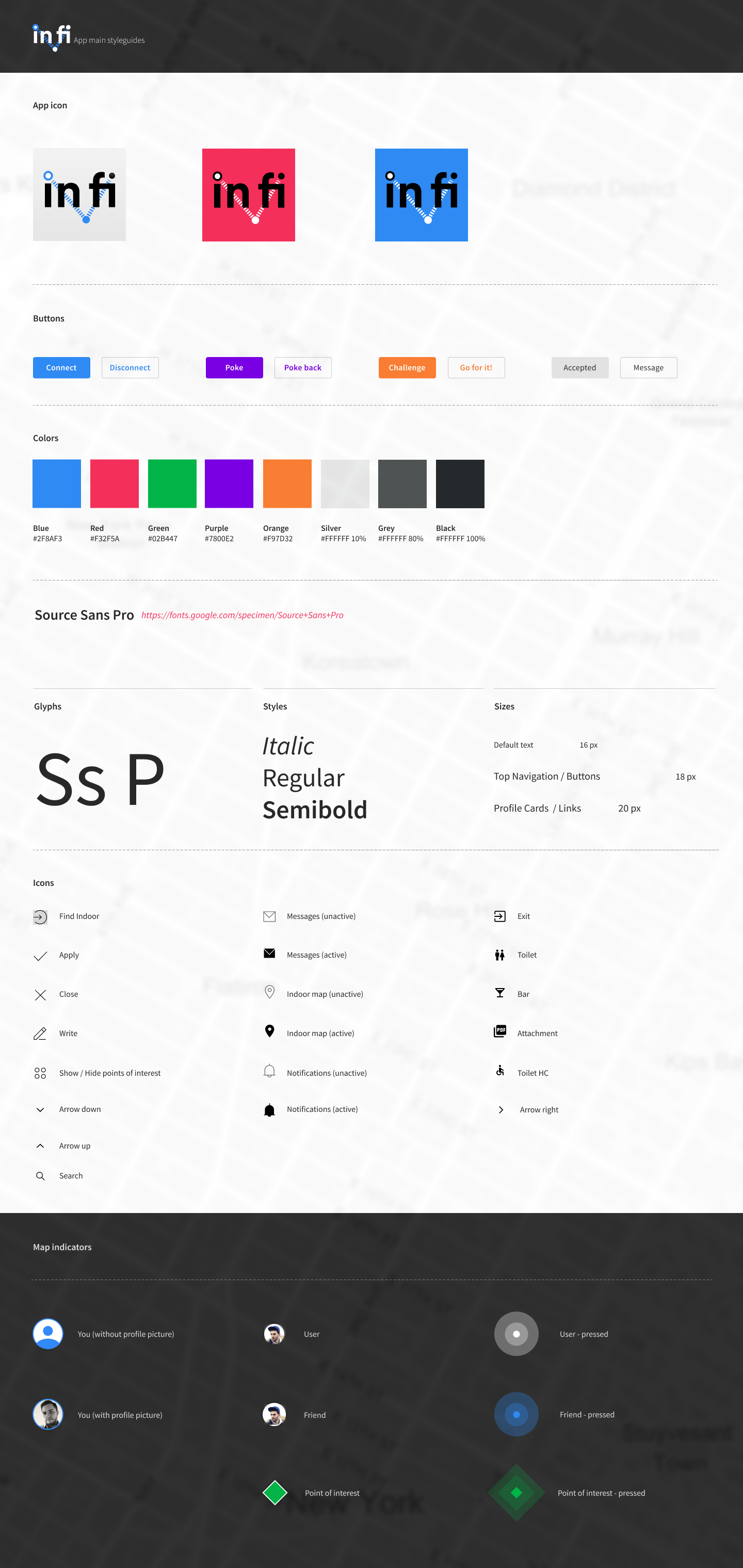
Building a Style Guide
To keep everyone on the same page, I documented:
- Components and their states.
- Typography and color hierarchies.
This worked great for our team, but when the client wanted to scale inFi globally, we needed something even more robust.

The journey to build inFi wasn’t just about creating a navigation app—it was about designing something that connects people and makes exploring fun.
Here are four additional success metrics to further evaluate the effectiveness of the inFi indoor navigation app:
- Average Session Duration: Measure the average time users spend in the app per session. A target average session duration of 10 minutes or more would indicate that users are finding the app engaging and are exploring its features thoroughly.
- Task Success Rate for Navigation: Measure the percentage of users who successfully navigate to a Point of Interest (POI) without assistance. A target success rate of 90% would demonstrate that the navigation features are intuitive and effective, validating the design choices made during development.
- User Engagement Rate: Measure the percentage of users who actively use the app at least once a week. A target engagement rate could be set at 70% of registered users, indicating that the app is effectively meeting user needs and encouraging regular use.
- Error Rate During Navigation: Monitor the percentage of users who report issues or errors while navigating to a POI. A target error rate of less than 5% would suggest that the navigation system is functioning effectively and that users are having a smooth experience.
By focusing on user needs, testing our ideas, and collaborating closely, we turned a futuristic vision into something practical and user-friendly.

.avif)