
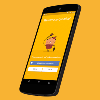
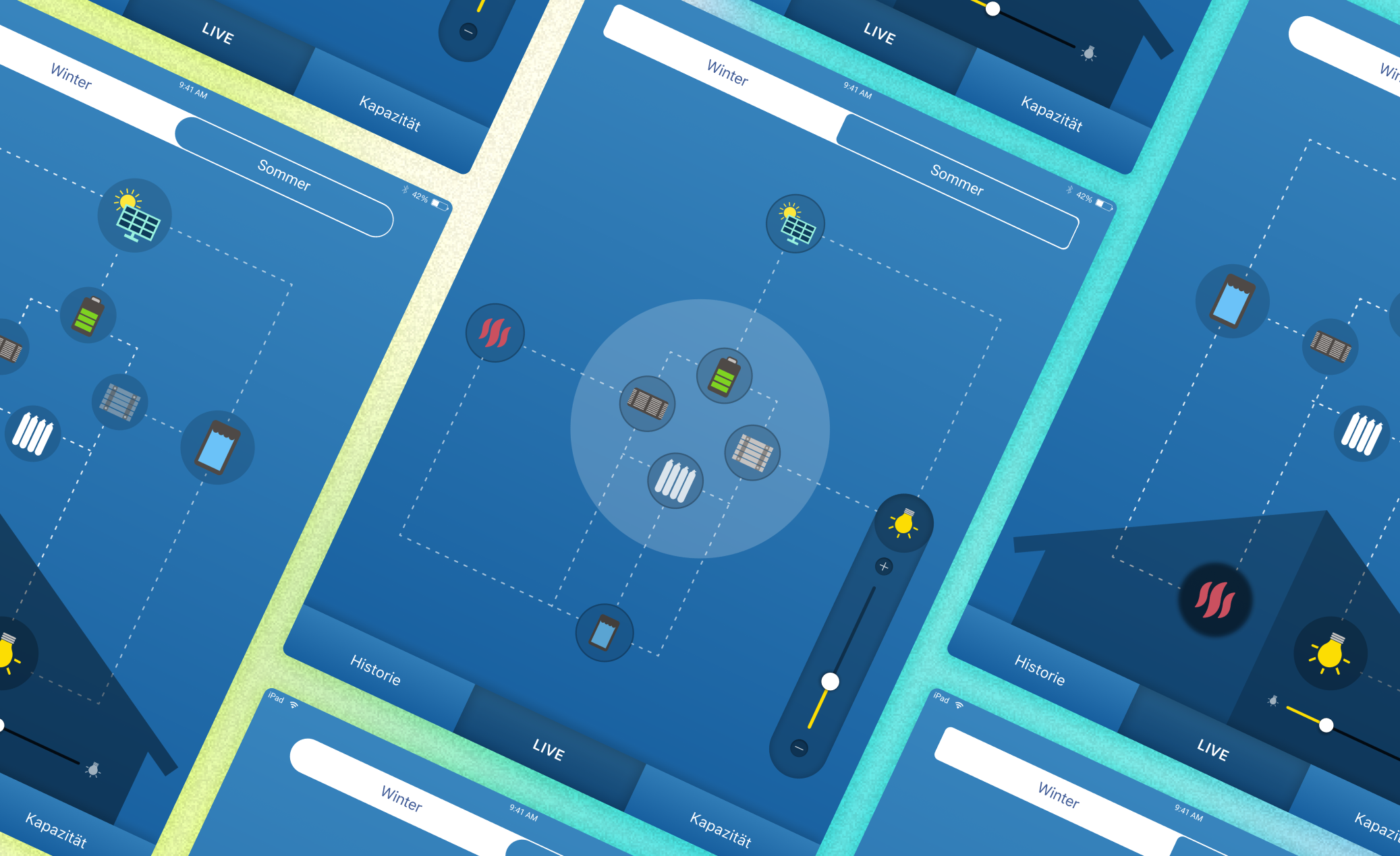
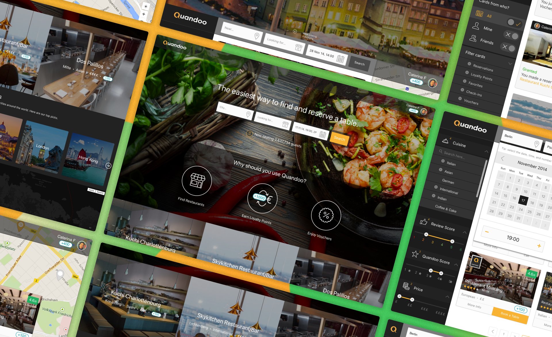
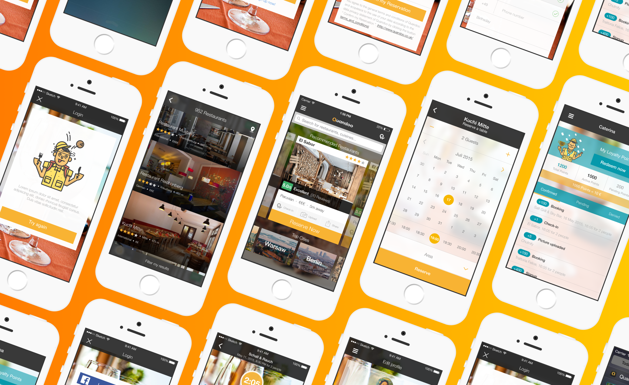
Building a great product is like orchestrating a symphony – every instrument, every note, needs to be perfectly in tune to create harmony. For us at Quandoo, that meant ensuring our Android users had an experience just as flawless and delightful as our iOS users. While the initial Quandoo journey began on other platforms, we quickly recognized a significant opportunity: to bridge the gap with Android users and bring the magic of effortless dining reservations to their devices.
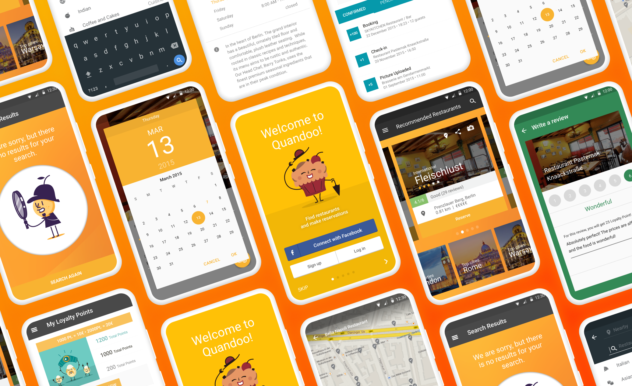
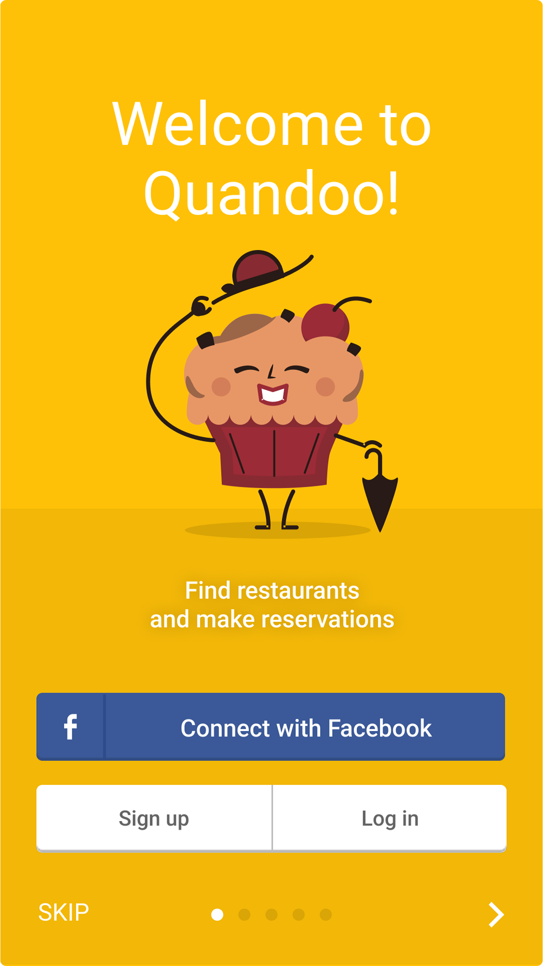
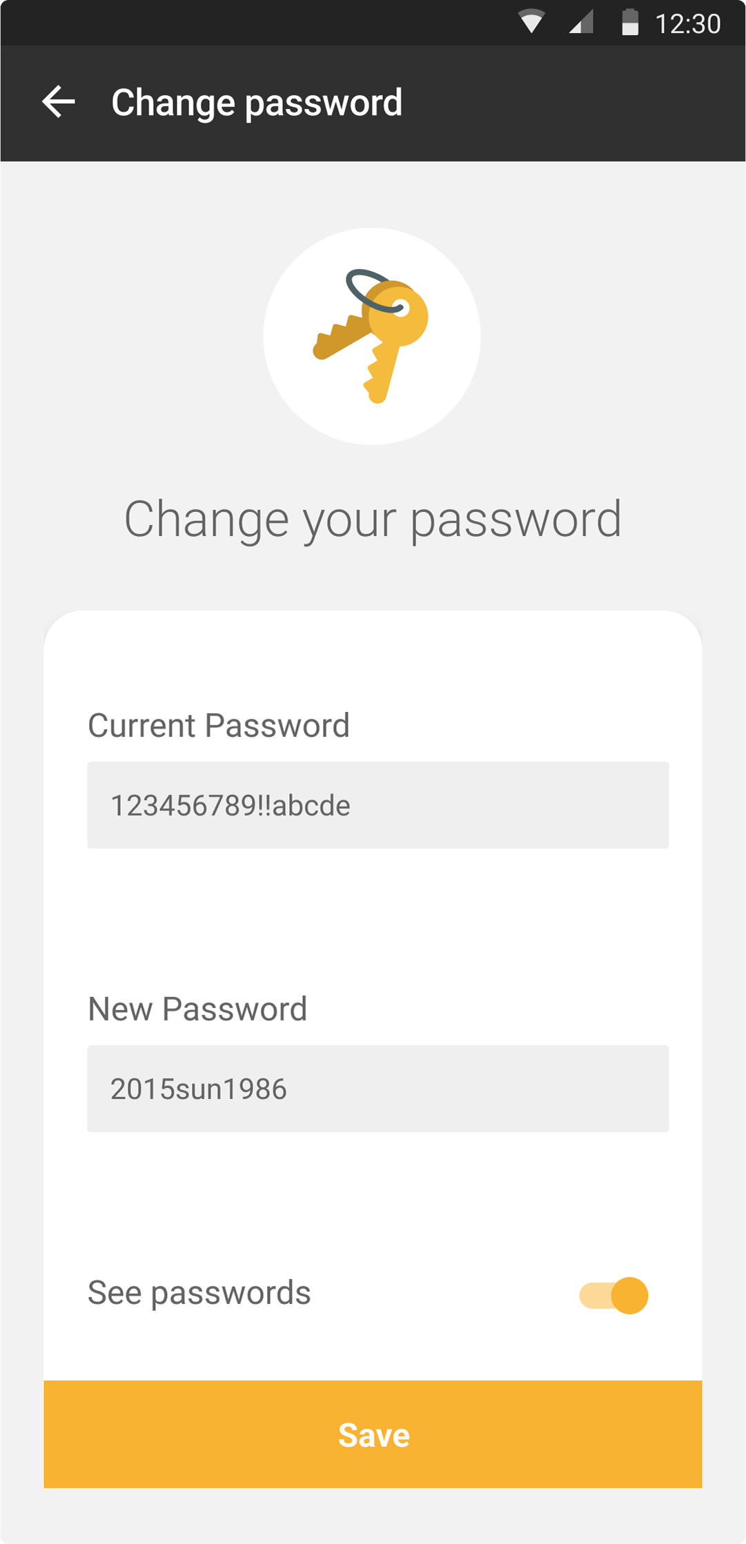
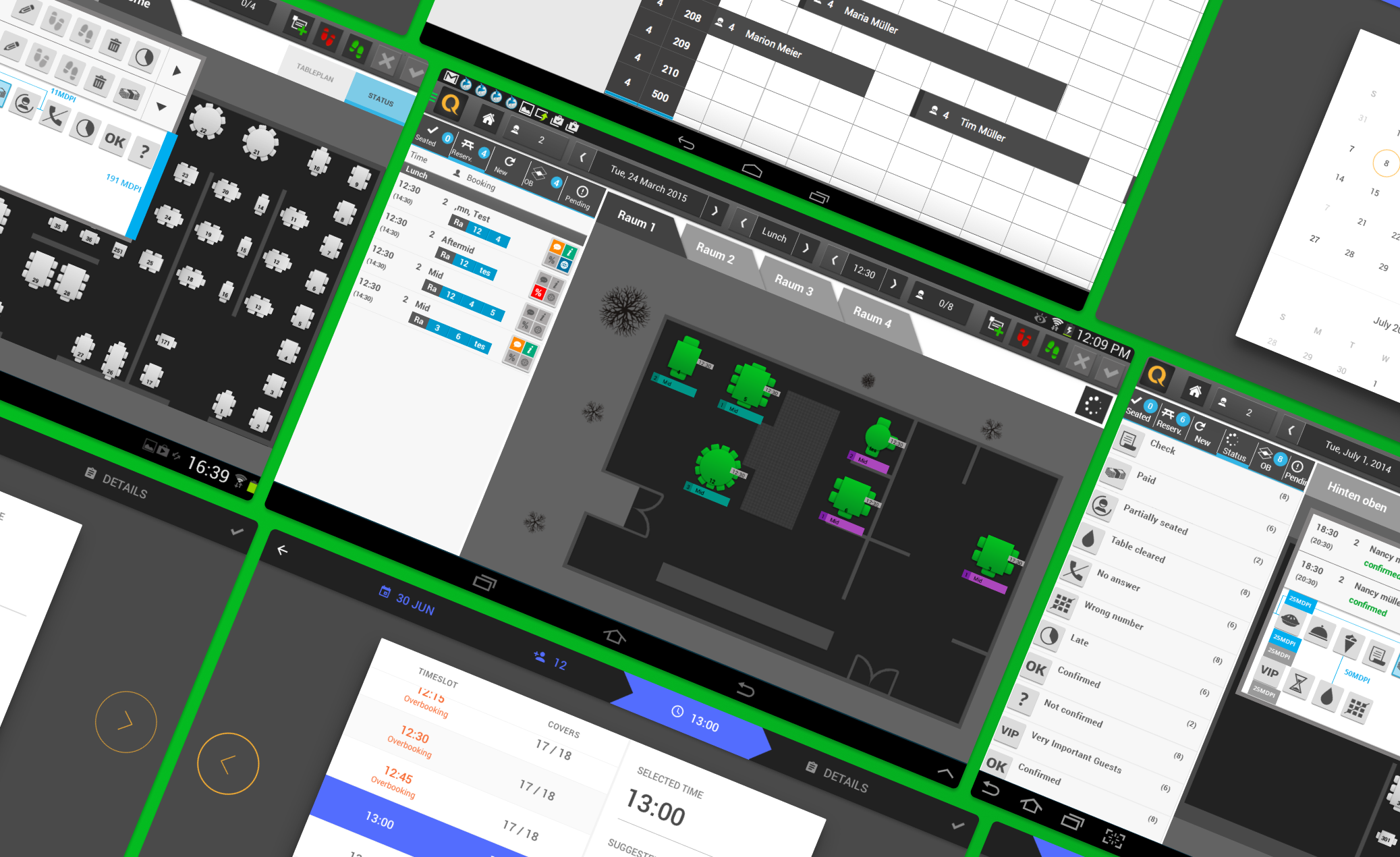
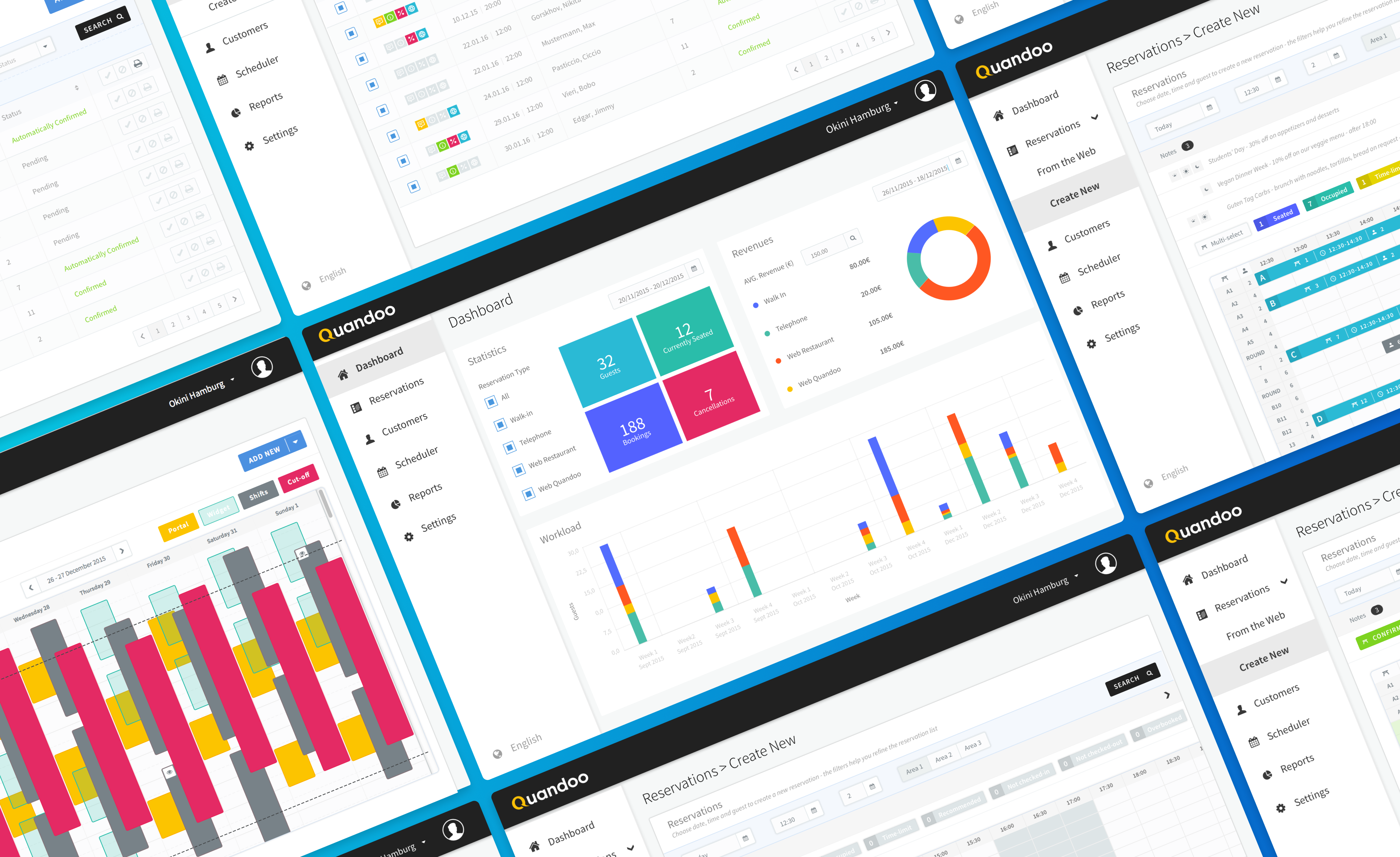
This was the very first version of the Quandoo Android app, and it was a monumental undertaking. I teamed up with our brilliant product and development crew to create an app that would not only help diners find and book tables at their favorite restaurants but also align perfectly with Google Material Design principles and our business goals. We rolled out new features, squashed bugs, and truly took customer feedback to heart to create a super user-friendly experience.
Right off the bat, we spotted some usability hiccups in the existing Android experience of our competitors.
It was crucial to identify these to build a truly intuitive app, that's why we analysed tones of user feedbacks, reviews and desk research, to find out several frustrations that hindered the common dining journey in almost 90% of available apps:
- Navigation Challenges: Users found it tough to move smoothly through the various restaurant options, leading to a less-than-ideal Browse experience.
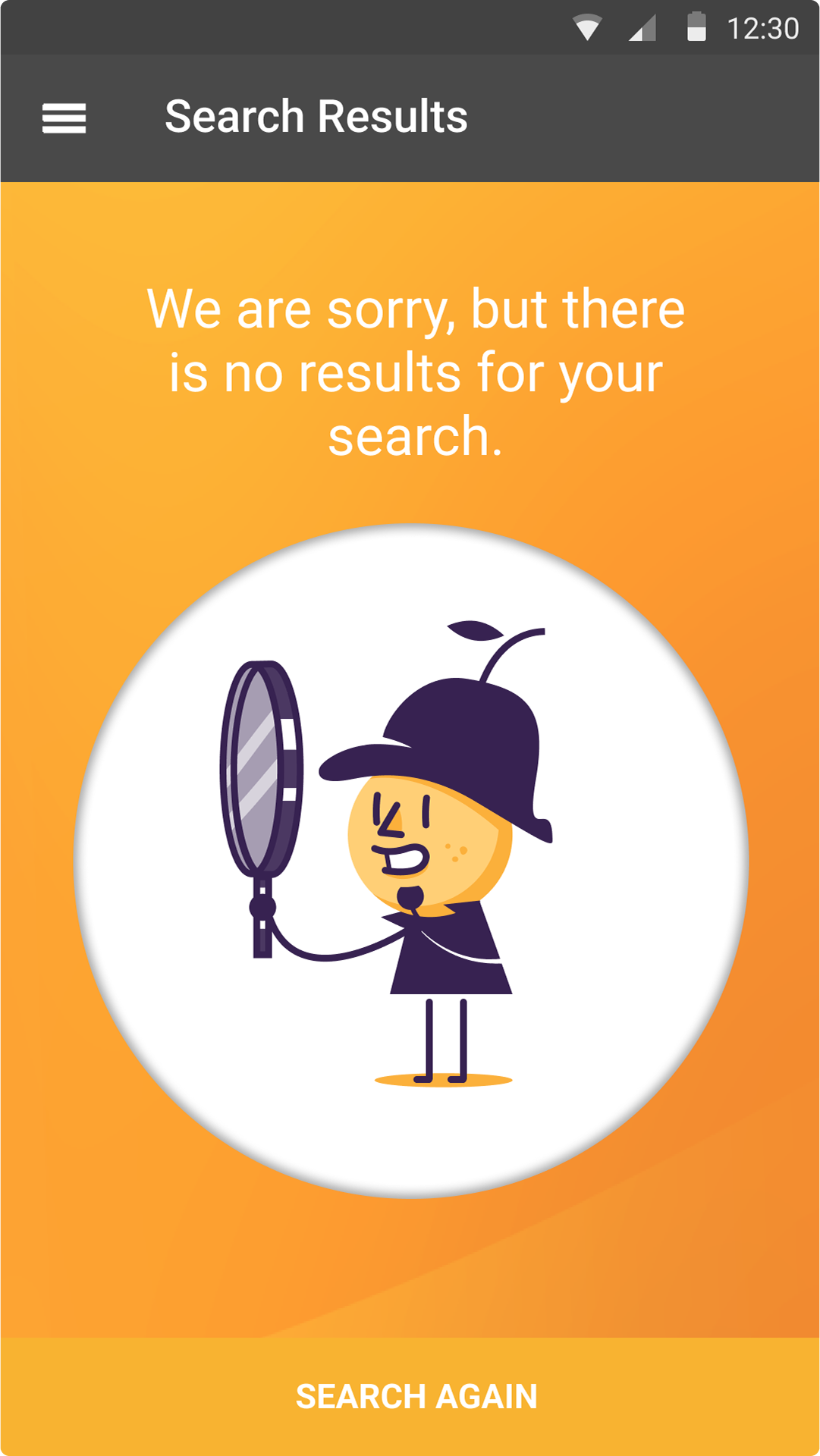
- Frustrating Search: The average search feature wasn't delivering the precise results users expected, leaving them feeling frustrated and unable to find what they wanted.
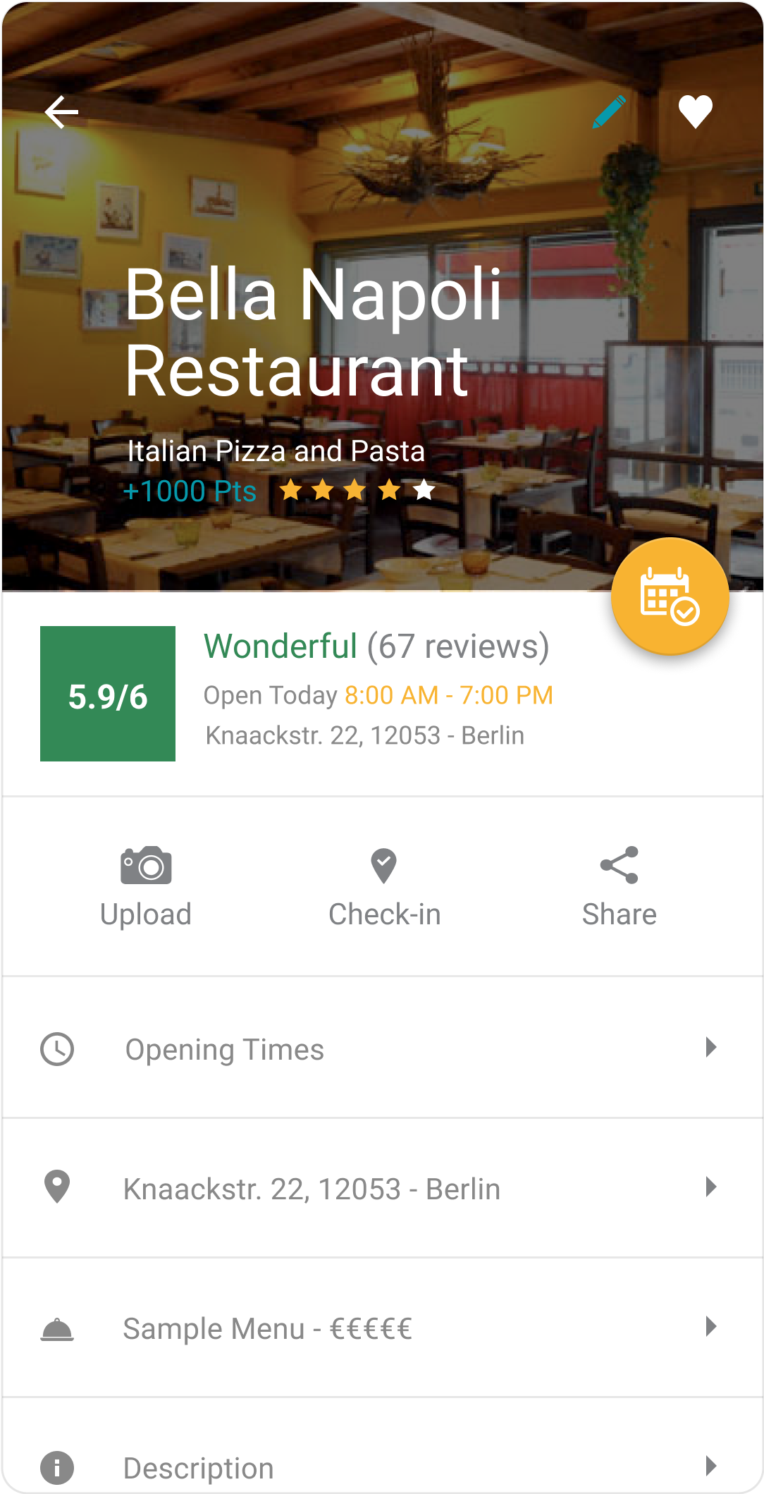
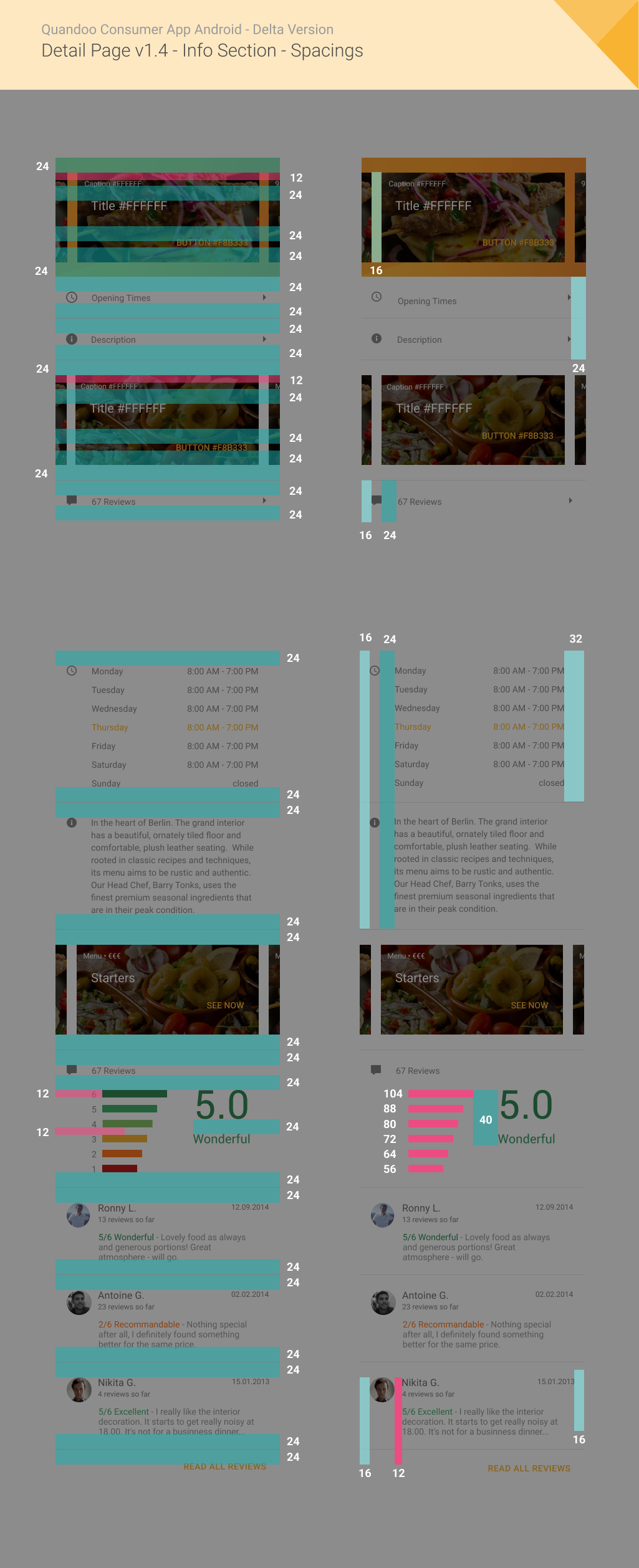
- Lack of Detailed Information: Many users craved more in-depth information and honest reviews about restaurants before making a decision.
What users complained about?
- Getting Lost in the App: Users were literally getting lost within the app, which often led to them abandoning their search for a table altogether.
- Search Engine Struggles: The search function often provided irrelevant results, making it incredibly hard for users to discover the perfect restaurant.
- Whispers, Not Voices: Users wanted a more direct and easy way to share their experiences and suggestions, hindering a sense of community and continuous improvement.
To get a clearer, more empathetic picture of who we were designing for, I developed a few key personas based on our user research:
- The Efficient Eater: This user needed quick access to restaurant options and an ultra-fast, efficient way to make reservations – time was always of the essence.
- The Culinary Curator: This diner absolutely loved discovering new cuisines and placed high value on detailed reviews and comprehensive restaurant information to fuel their culinary adventures.
- The Social Selector: This group enjoyed sharing their dining experiences with friends and relied on recommendations, valuing features that fostered a community vibe.
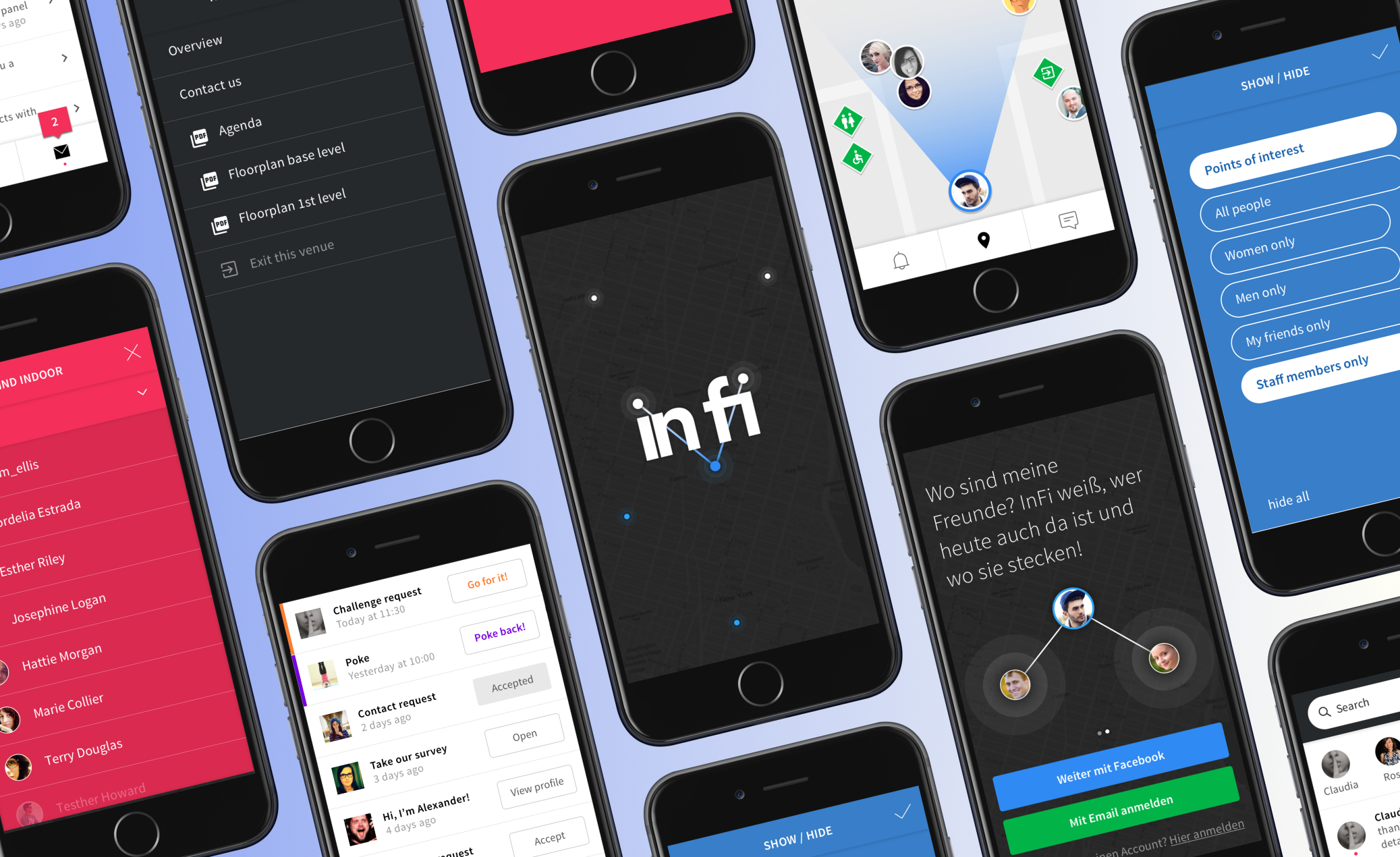
We embraced a hands-on approach to testing, which was critical for understanding user behavior and refining our designs.
Tools of Discovery
- Direct User Dialogues: We had direct, valuable conversations with users, gathering deep insights into their experiences, frustrations, and what they truly desired from a dining app.
- Experiential Testing: We conducted A/B tests to compare different design tweaks. This allowed us to see firsthand how various elements affected user engagement and make data-driven decisions.
- Behavioral Analytics: We leveraged Google Analytics to meticulously track user behavior, pinpointing exactly where users were dropping off in the reservation funnel and identifying areas needing improvement.
Based on everything we learned from our research and testing, here’s how we transformed the Quandoo Android app:
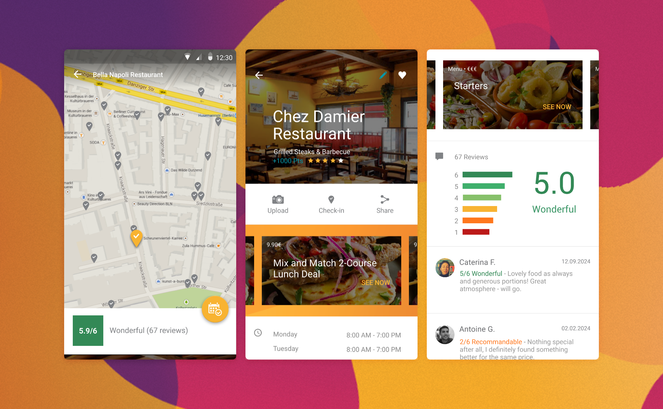
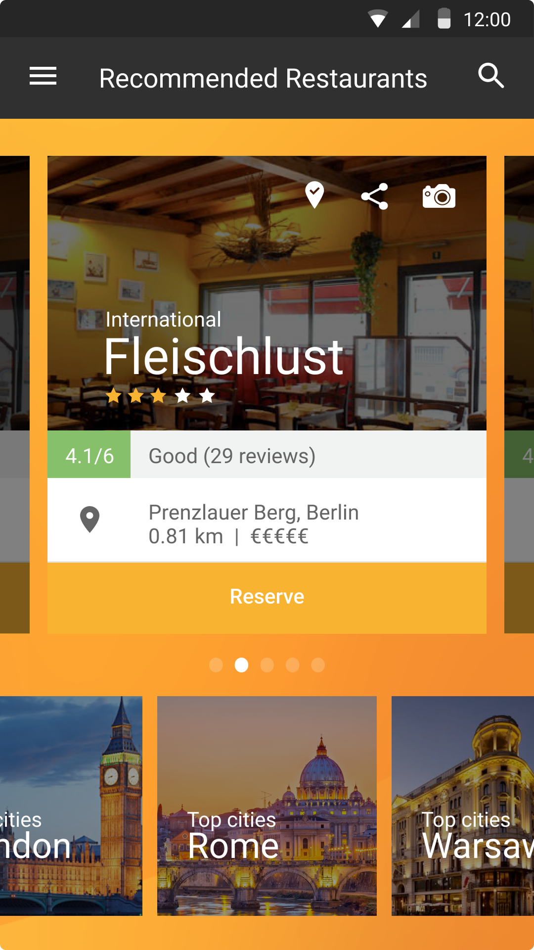
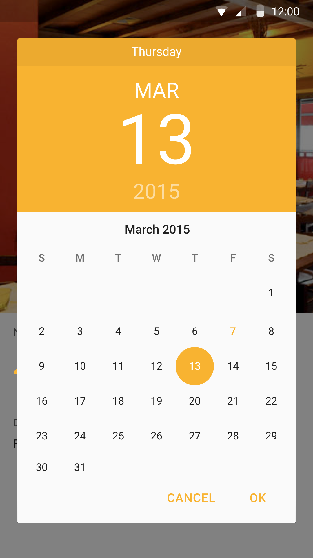
- Easy Navigation: We proposed a simple, clean layout, making it incredibly intuitive and easy for users to browse and book tables without getting lost.
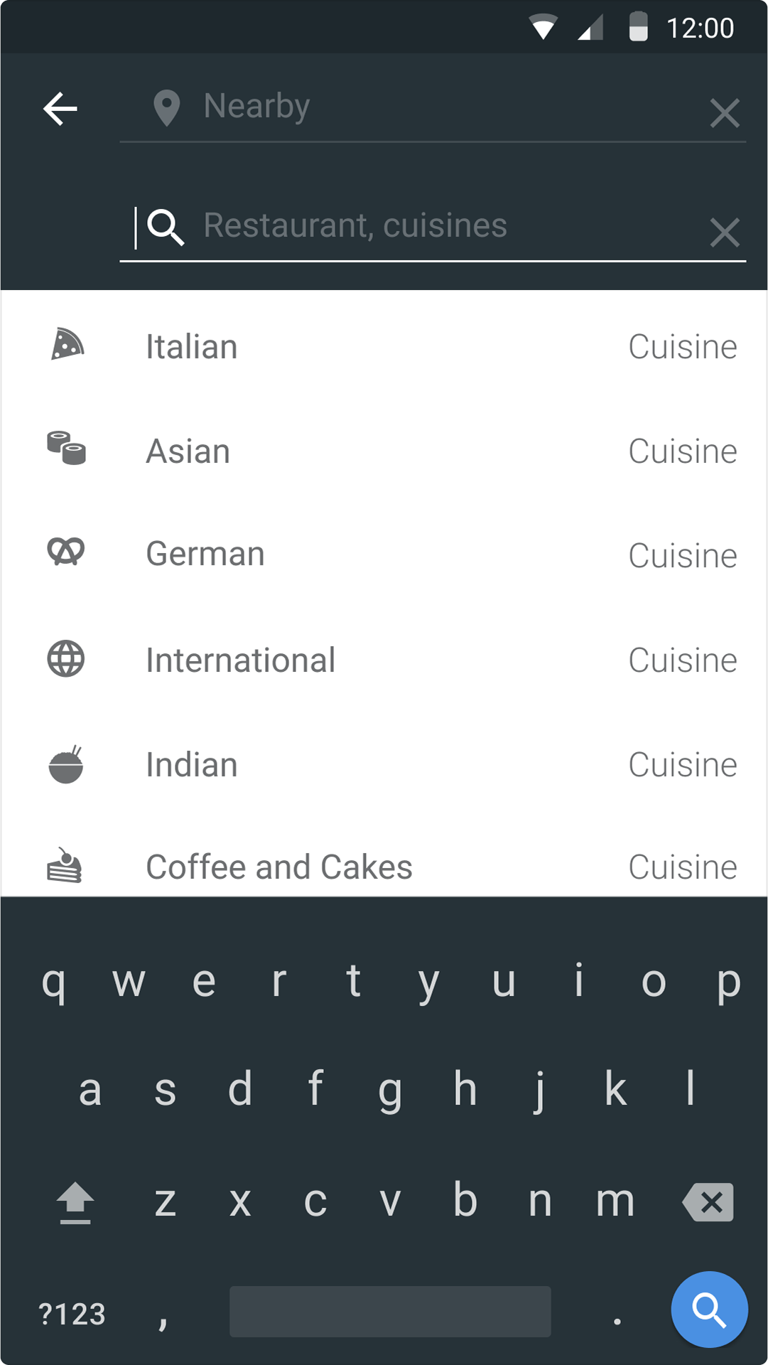
- Tailored Search & Filter: We integrated advanced filters, allowing users to search by cuisine, distance, ratings, and more. This delivered much more relevant and satisfying search results.
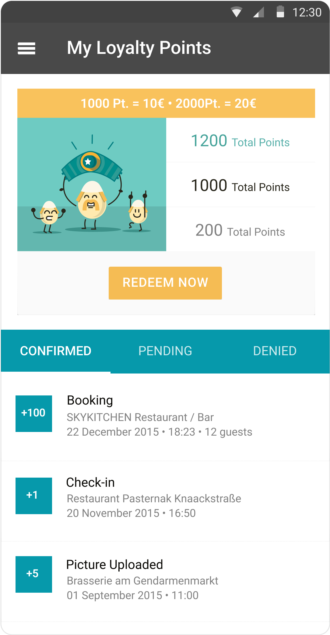
- Community Connection: We introduced a simple, prominent way for users to submit feedback and reviews, fostering a vibrant community and providing continuous insights for improvement.
The results of our Team work were incredibly encouraging. We were proud to see the Quandoo Android app achieve a strong 4.6-star rating on the Google Play Store, a direct reflection of user satisfaction. Our feedback feature proved invaluable, with an impressive 50% feedback submission rate, demonstrating how engaged users were in helping us continually refine the experience.
Most importantly, we observed a solid 60% reservation completion rate, indicating that our efforts to streamline the booking process were highly effective in helping users successfully secure their tables.
This project truly showed the importance of putting users first in every step of the design process. Talking to users throughout gave us the precise insights needed to make smart decisions. I learned that iterating based on real, honest feedback isn't just helpful – it's absolutely key to creating a product that truly works for everyone and resonates deeply with its audience.

.avif)