
Once upon a time, there was the phone. Remember it? We used to call restaurants to check availability for a glorious, crowded birthday dinner or a late-night tête-à-tête. It was fine, except for those of us who are extremely introverted (like me) or non-native speakers (also me!). And what about those last-minute changes, like that friend who always cancels at the last second? Then the internet came along and changed everything.
This shift opened up a huge opportunity, and as a UX/UI designer at Quandoo, I had the privilege of being part of the team that completely transformed the restaurant reservation experience. We wanted to empower users to effortlessly book tables right from their iPhones, anytime, anywhere.
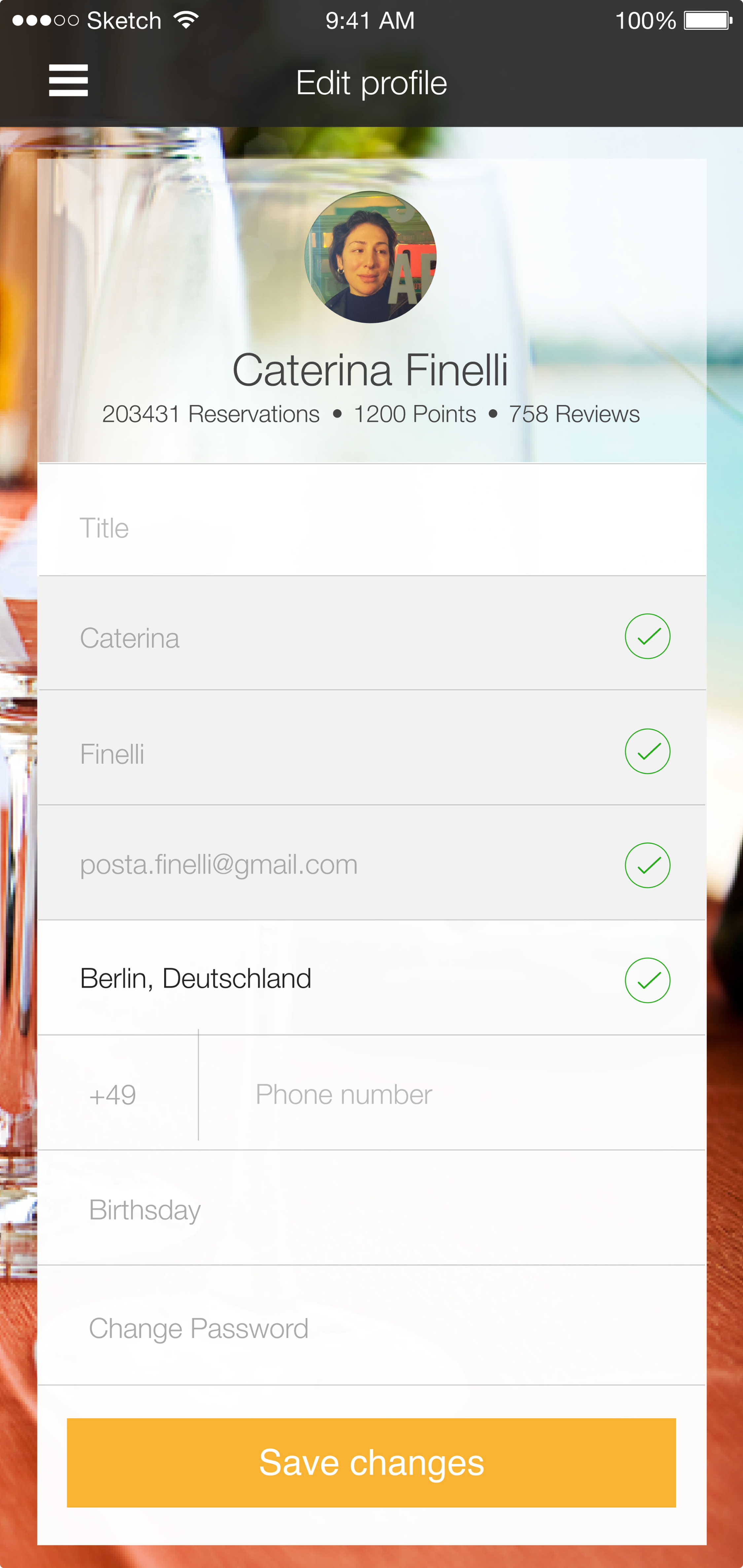
We knew that booking a table should be just as enjoyable and stress-free as the dining experience itself. Our approach to designing the Quandoo iOS consumer app was all about being user-centric and intuitive. We meticulously crafted every screen, interaction, and flow to ensure a seamless and delightful journey from discovering a restaurant to confirming a reservation.
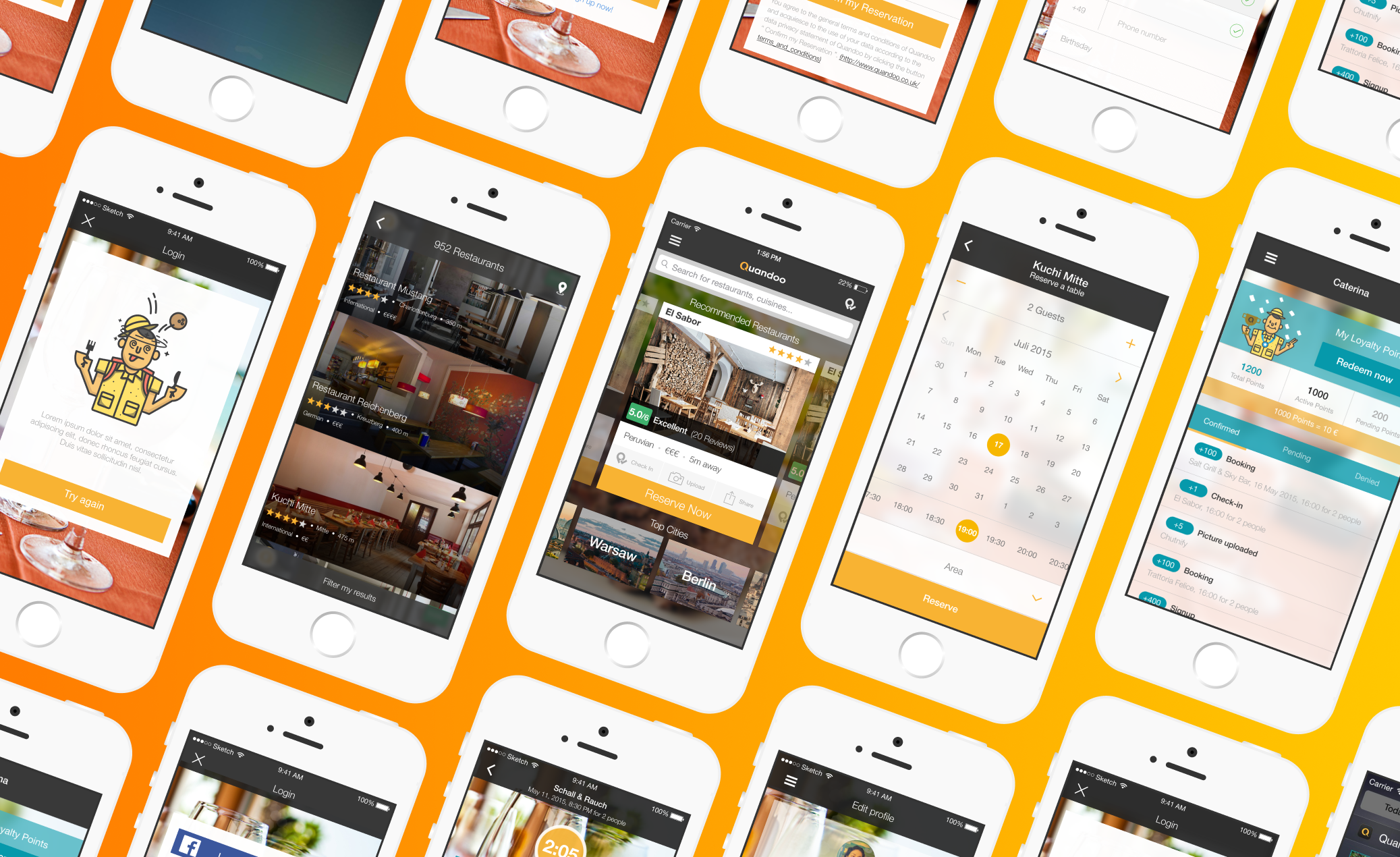
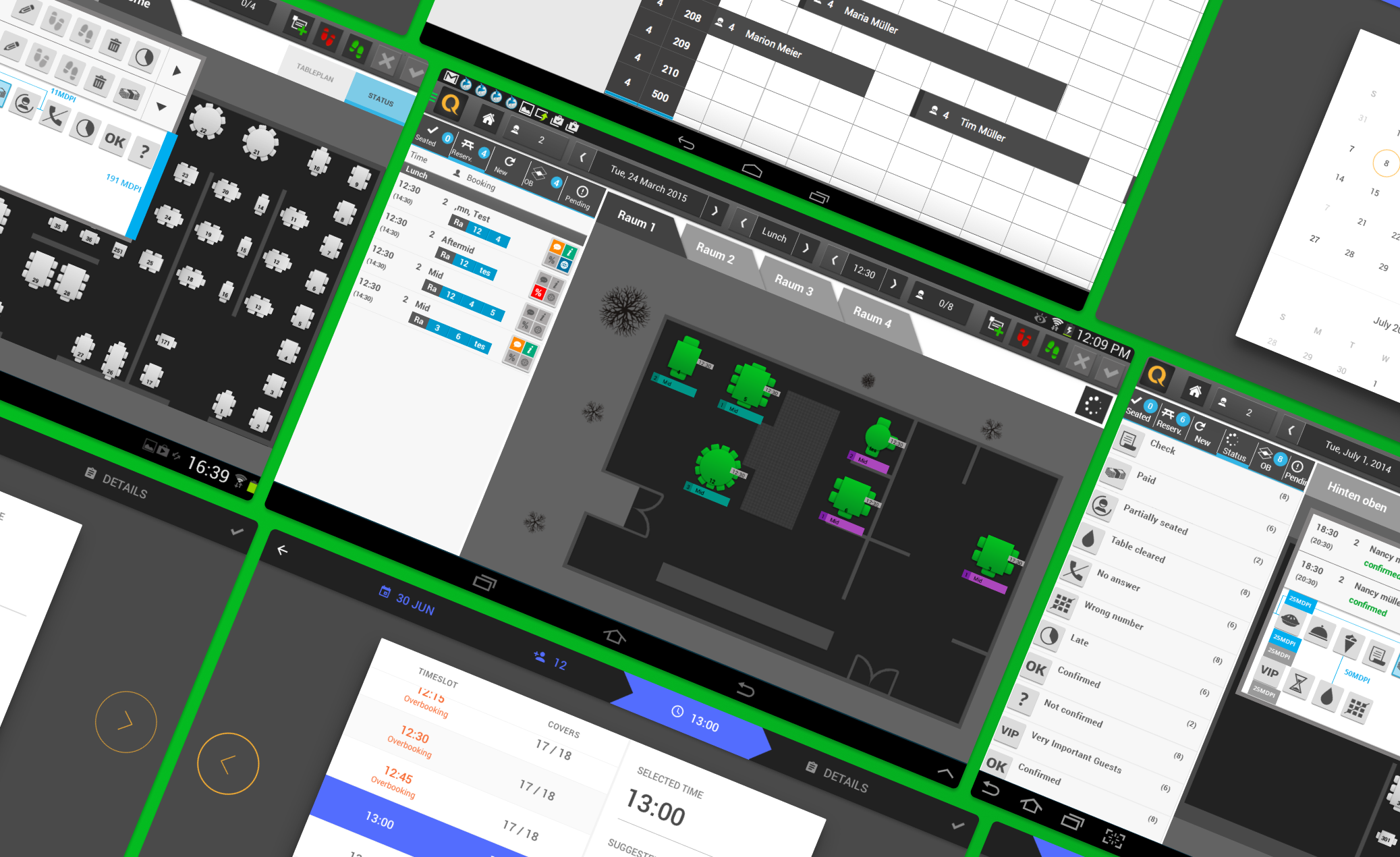
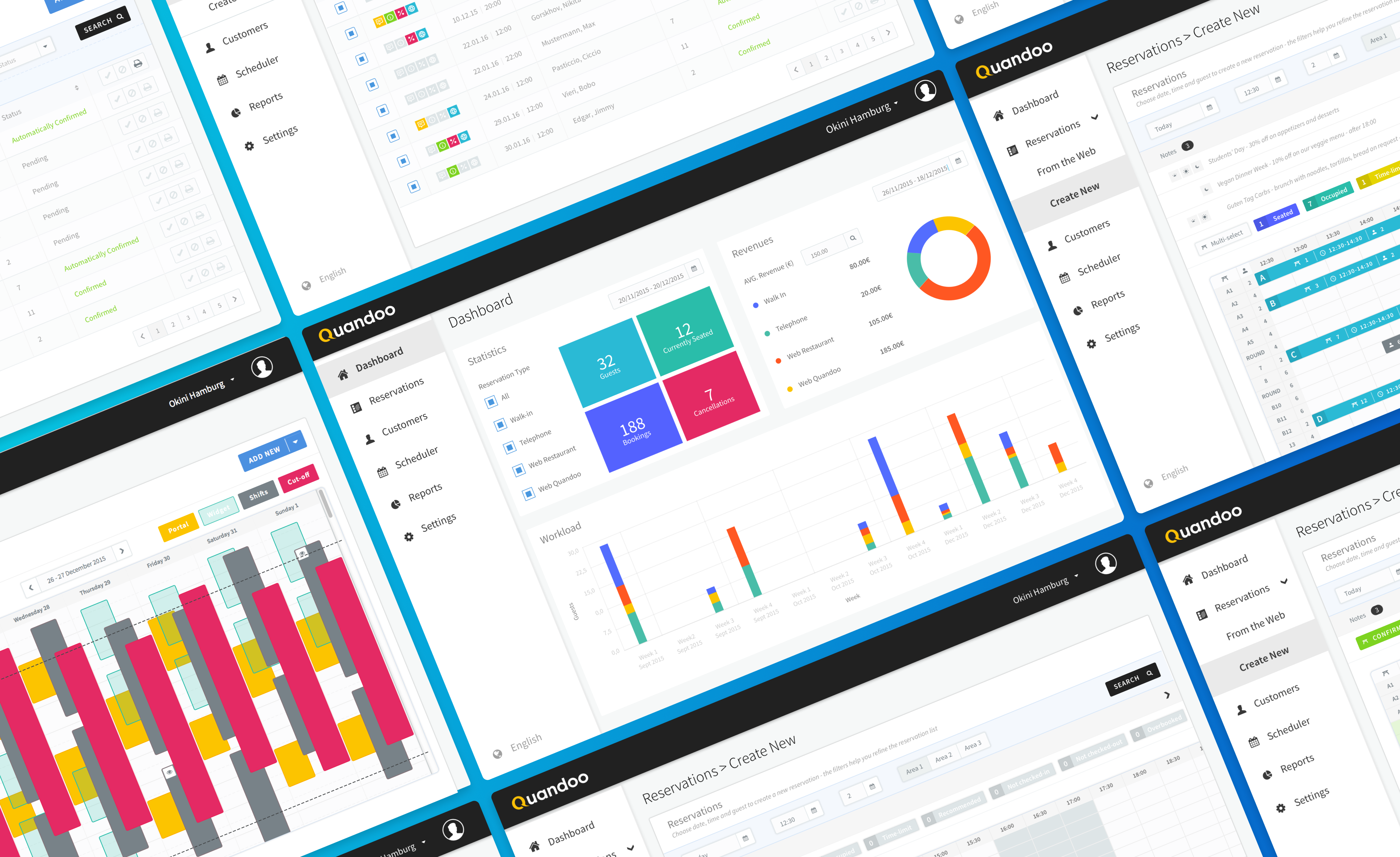
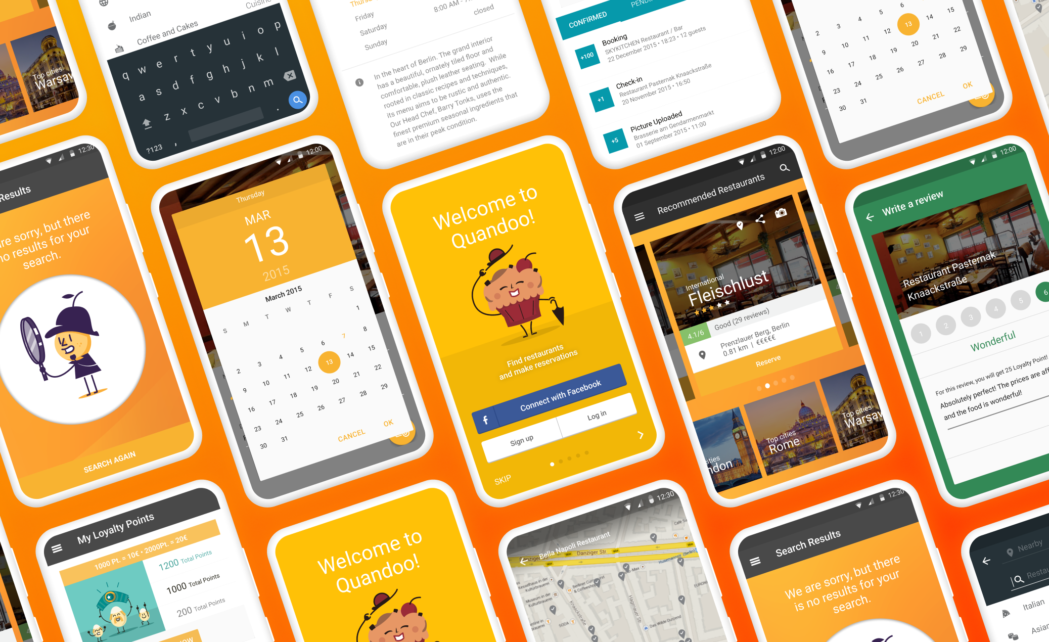
We knew our existing first app had some room for improvement, and honestly, users were feeling it. We dove deep to figure out exactly what was getting in their way, aiming to transform their experience from frustrating to fantastic.
Where users got stuck? We heard pretty clearly that a few things were making our users scratch their heads:
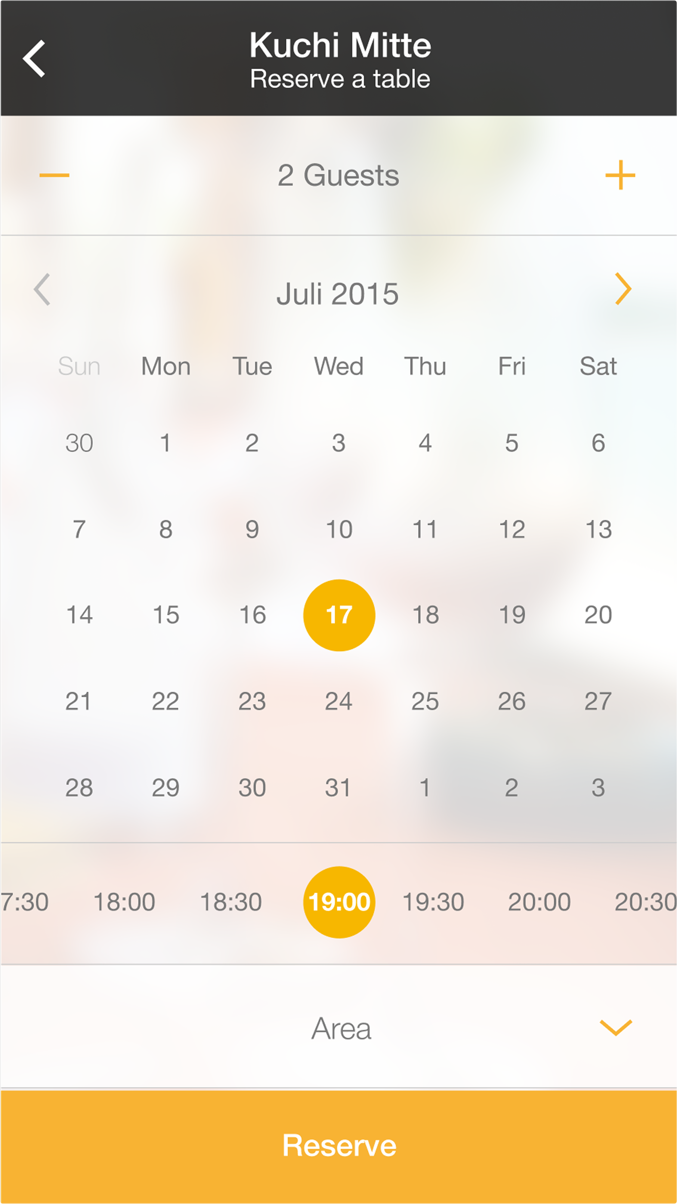
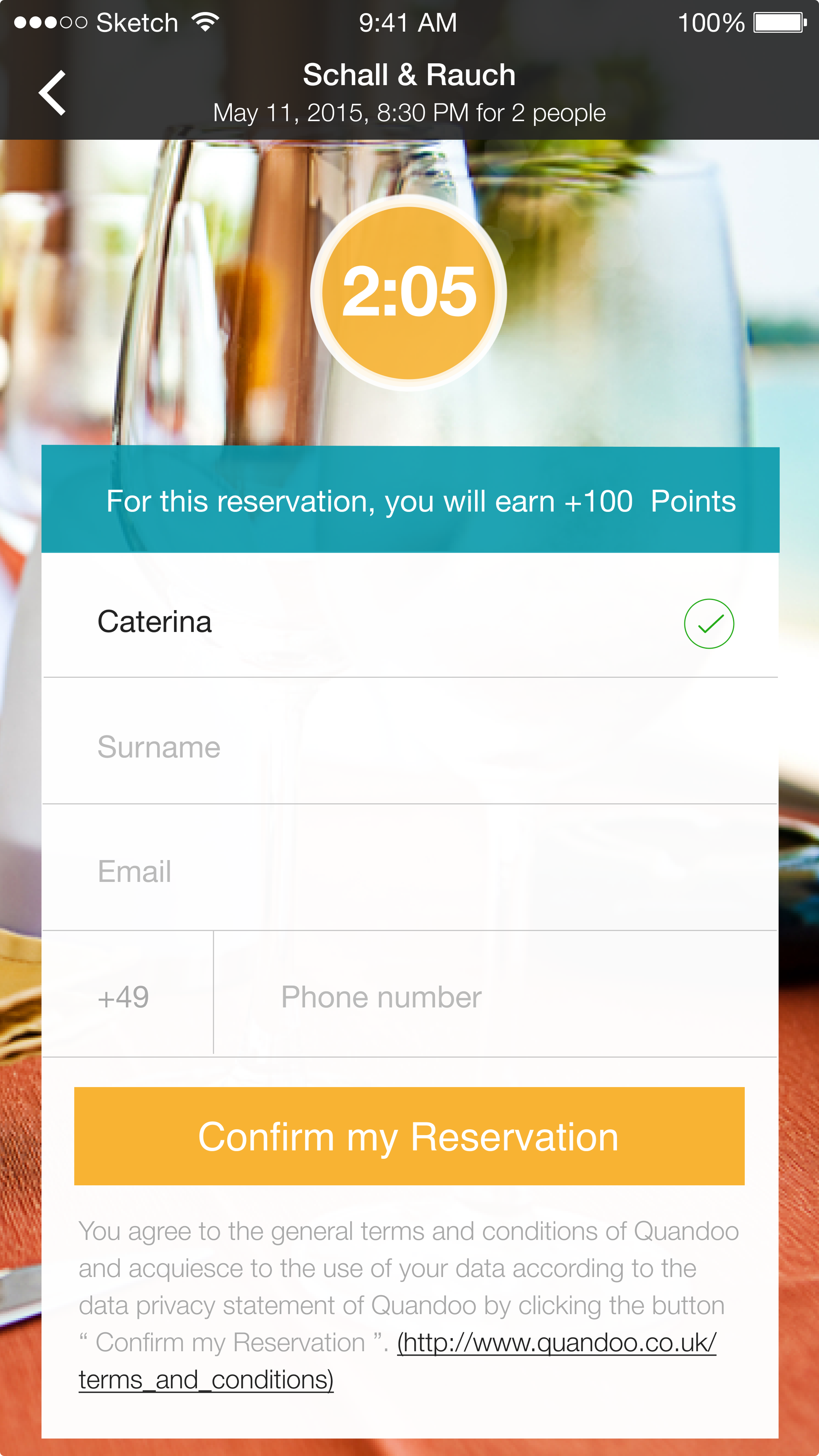
- Booking loops: Imagine trying to book a table for a special occasion, only to get lost in a maze of steps. Users told us the reservation process felt clunky and took too much time.
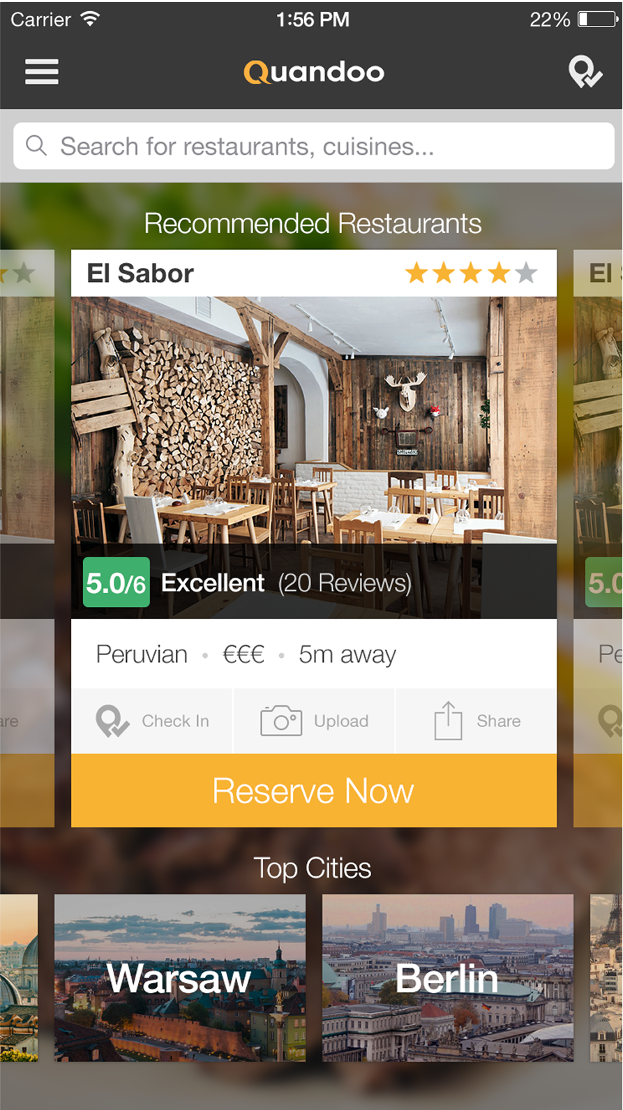
- Missing Details: Ever try to find a restaurant's menu or opening hours, and it's like a treasure hunt with no map? Users struggled to find crucial details, which made choosing a place harder than it needed to be.
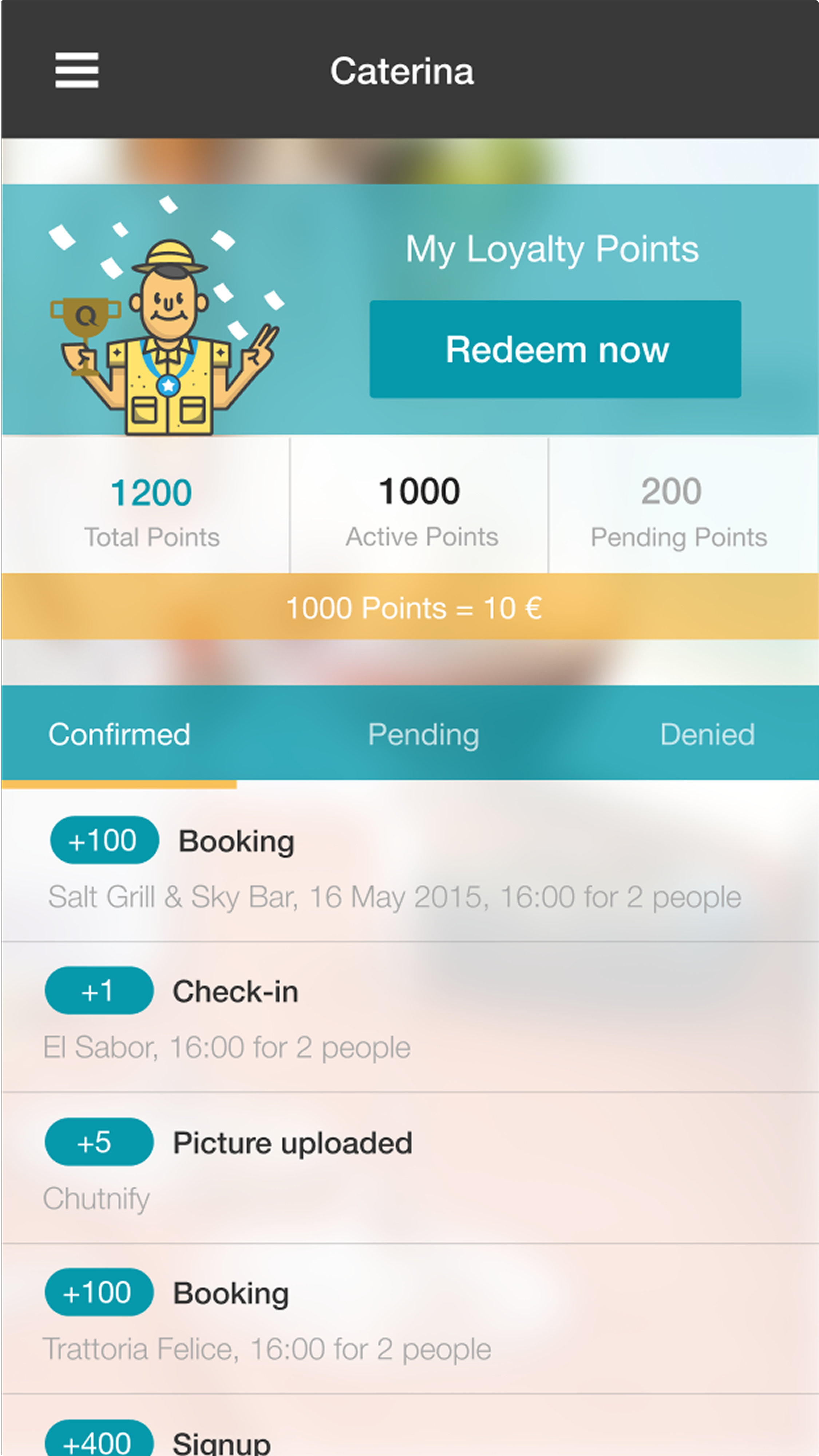
- Loyalty Labyrinth: Our loyalty program was meant to be rewarding, but users were confused about how to earn or use their points. It was like having a prize without knowing how to claim it - ehm.
Through countless user interviews and feedback, we uncovered the heart of these issues:
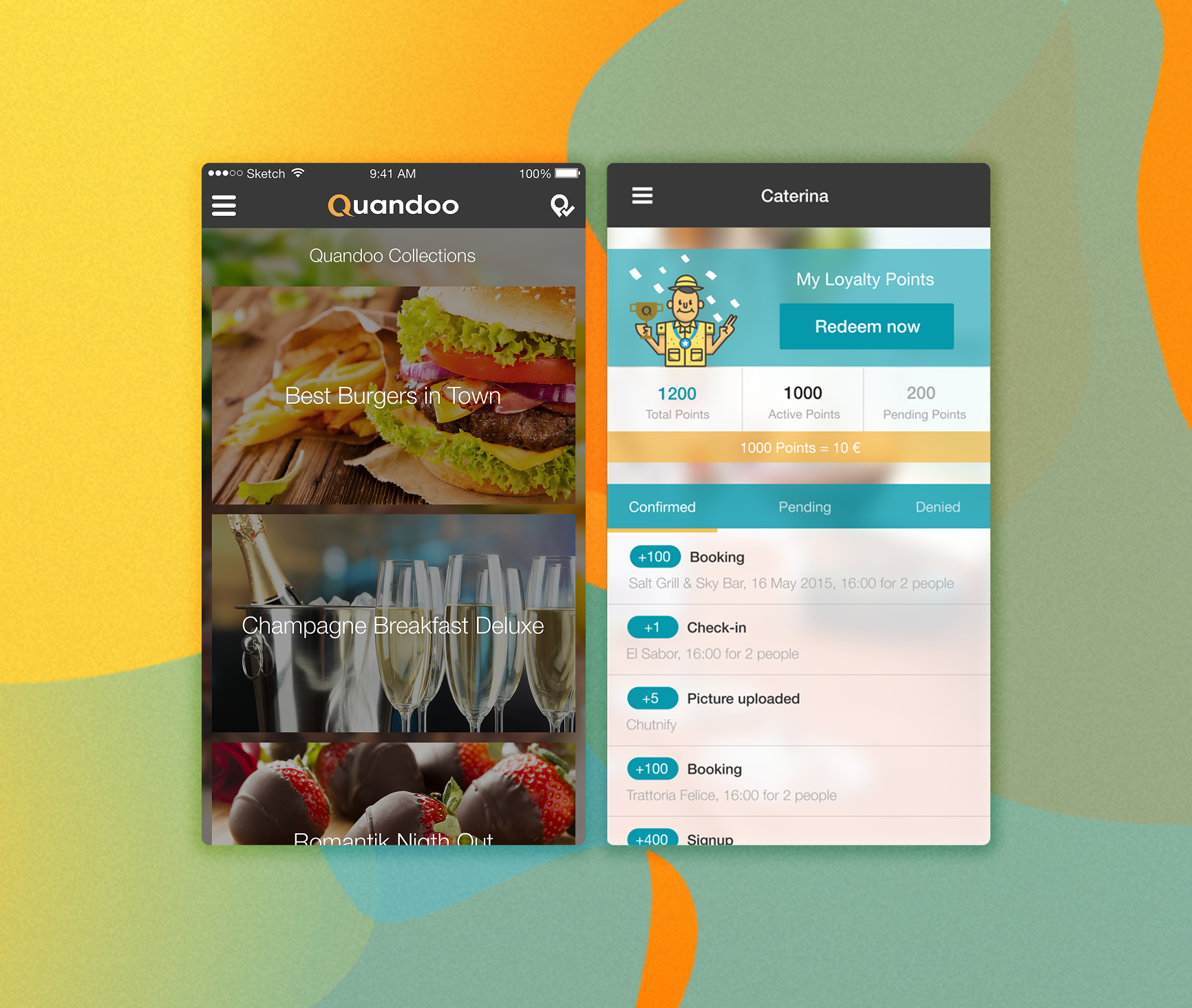
- The Calendar Conundrum: The old booking calendar was just… a lot. Users found it cluttered and tricky to quickly pick dates and times.
- Elusive Restaurant Info: Key restaurant details were often incomplete or buried deep within the app, making it tough for users to make confident decisions.
- Invisible Points: Our fantastic loyalty points system was practically invisible, lol. Users weren't aware of their balance or how to redeem them, leading to missed opportunities for delightful surprises.
To truly connect with our users and design successful solutions, we created personas – fictional characters representing our real users. This helped us walk in their shoes:
- The Go-Getter Gourmets: These are our speed demons, they dine out often and want to book tables in a flash. They're always on the lookout for new spots and love features that make booking super smooth.
- The Casual Connoisseurs: This group enjoys a good meal out but maybe not every week. They value solid recommendations and often rely on reviews and ratings to pick their next culinary adventure.
- The Reward Rulers: These users are all about those loyalty points. They're eager to stack up rewards and appreciate crystal-clear info on how to earn and redeem them.
We’re big believers in testing, testing, and more testing. We used a mix of techniques to gather insights and make sure our designs were truly user-friendly:
- Usability Testing: We sat down with users as they navigated the app, observing where they got stuck or delighted. It was incredible to see their real-time reactions and pinpoint exactly where we needed to improve.
- A/B Testing: We'd present users with two different versions of the reservation process, and see which one they preferred and interacted with more smoothly. This helped us make data-driven decisions on the best path forward.
- Surveys: We sent out surveys to gather a wider range of opinions, asking about satisfaction levels and what features users dreamed of. This gave us a fantastic overview of what mattered most to our community and helped us measure the impact of our changes.
Let's say the numbers truly spoke for themselves. We were thrilled to report an impressive 85% reservation completion rate, a clear indicator that our flow was intuitive and effective, guiding users smoothly from discovery to confirmation. Furthermore, our efforts to enhance the loyalty program had paid off, with a fantastic 50% participation rate, showing that users were actively engaging with and valuing their rewards.
Perhaps most tellingly, we saw a significant 15% decrease in drop-offs during the reservation process, a clear sign to how effectively we addressed key pain points and streamlined the user journey. These results underscored the powerful impact of user-centered design and validated our commitment to creating a truly seamless and rewarding experience for every Quandoo user.

.avif)