

Let's say there's an audio engineer at a live concert, their fingers dancing across a mixing console, tweaking levels and effects in real-time to create the perfect sound. Or a musician in a studio, shaping their instrument's tone with precision. The Behringer X32 mixer console is a powerhouse in this world, but we saw an opportunity to make it even more intuitive, more powerful, and truly a joy to use. This project was all about modernizing this iconic mixer by seamlessly integrating a touchscreen, thereby enhancing accessibility and dramatically improving the overall user experience for dedicated audio professionals and passionate musicians alike.
My approach was a deeply user-centered one, structured into several key phases, much like composing a perfect track – each layer building on the last to create a harmonious whole.
Like a sound engineer setting up microphones, we first had to listen intently to our users.
Discovery Activities:
- We conducted in-depth user interviews and observations, spending time with audio engineers and musicians in their natural habitats – bustling live venues and focused recording studios – to truly understand their intricate workflows.
- We analyzed existing user feedback and interaction logs like musical scores, searching for common "pain points" or areas where the rhythm was off.
The AHA moment:
This initial phase was incredibly insightful. It revealed critical frustrations, particularly around the complexity of EQ adjustments (those precise tone-shaping controls) and the visibility of key parameters. Users often struggled with the precision and speed needed for EQ tweaks during live performances, and quickly accessing controls felt like a treasure hunt. These were prime opportunities for a new, touch-based solution.
Based on this, our core design goal became crystal clear: "Create an intuitive and efficient touch-based interface that improves user experience and simplifies parameter adjustments."
With a clear goal in mind, we moved into the creative phase, sketching out new possibilities like a composer writing melodies.
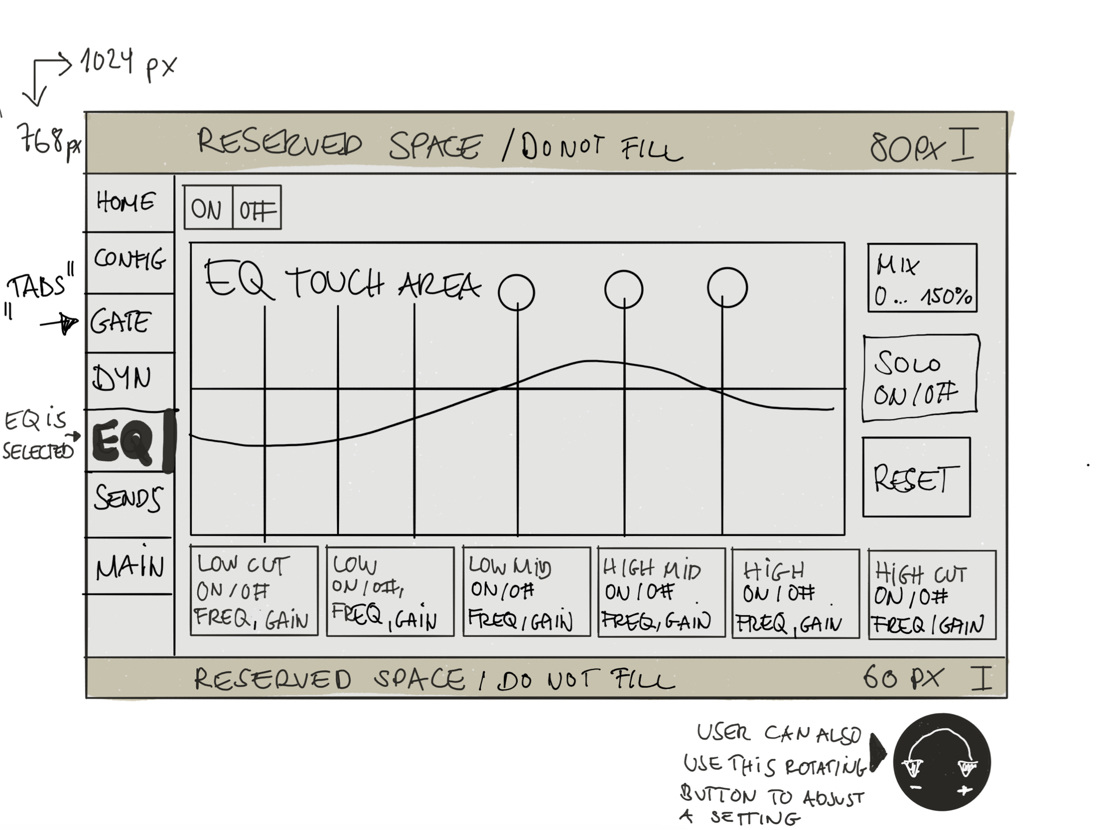
- We started with hand-drawn wireframes, quickly exploring various design concepts for the new interface.
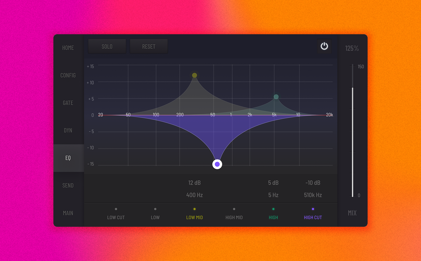
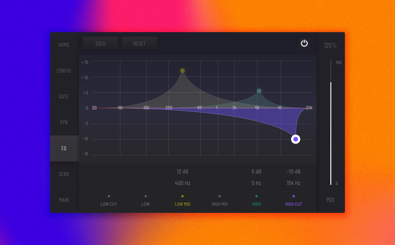
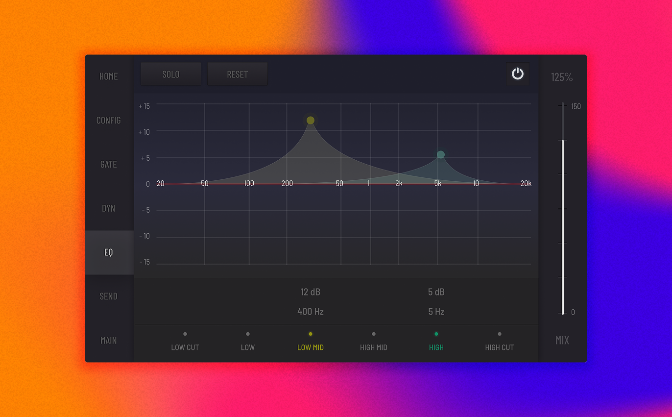
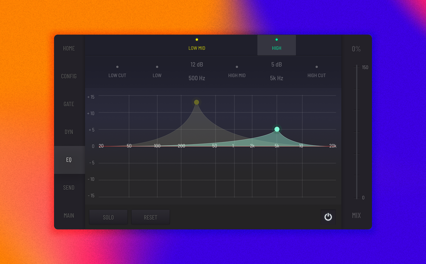
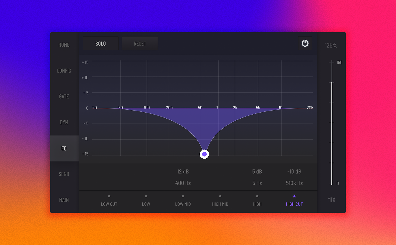
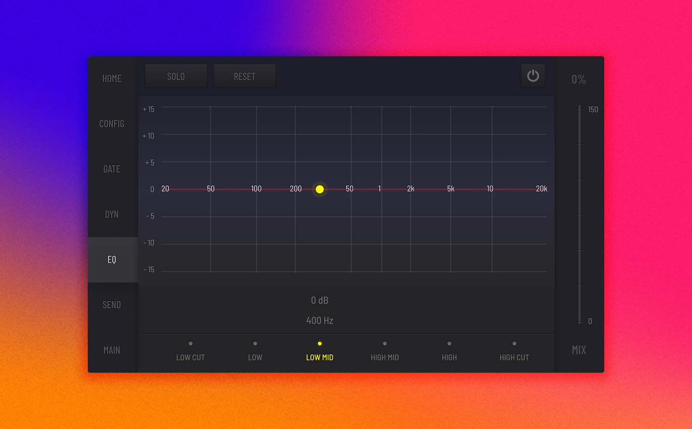
- A major breakthrough was the concept of a touch-enabled EQ graph. This allowed users to directly manipulate audio parameters by dragging points on a visual curve – a stark contrast to fiddling with tiny knobs.
- We designed two distinct layout variations for the controls panel:
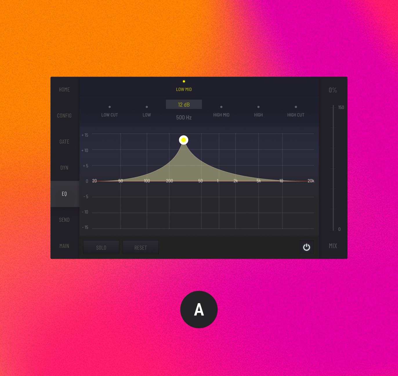
- Version A: Parameter controls were placed at the top of the screen for maximum initial visibility.
- Version B: Controls were moved to the bottom, aiming for a more ergonomic and natural touch experience.
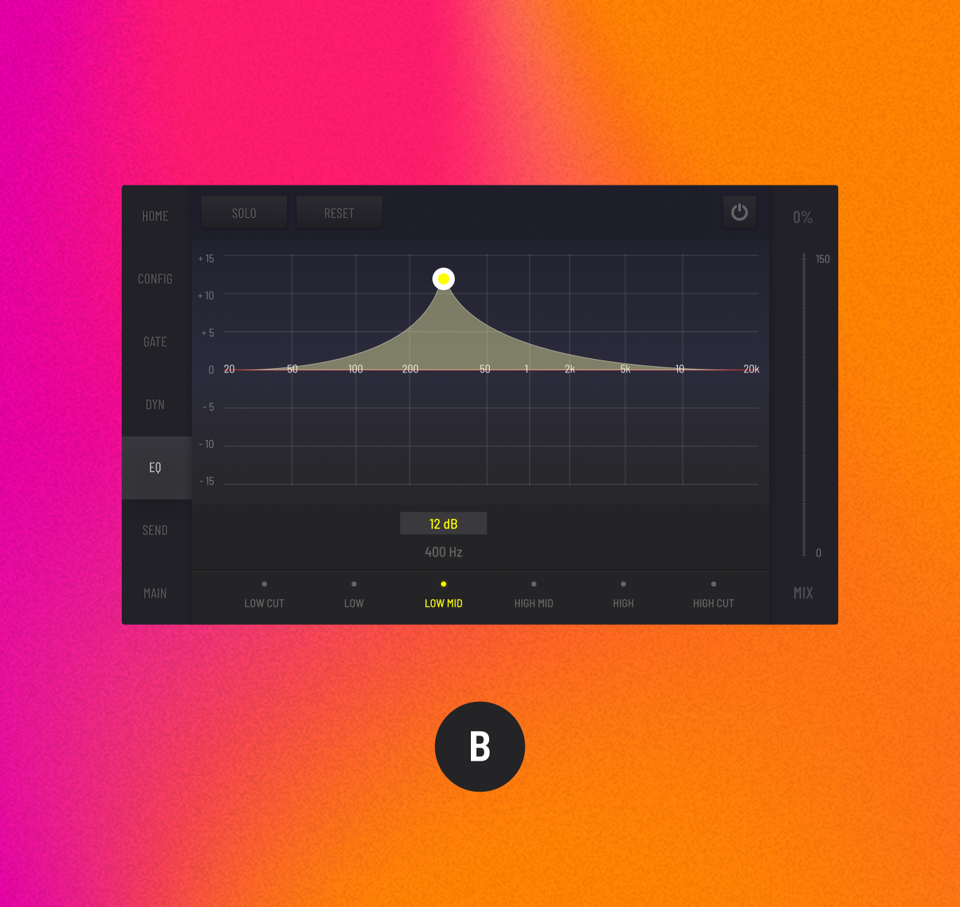
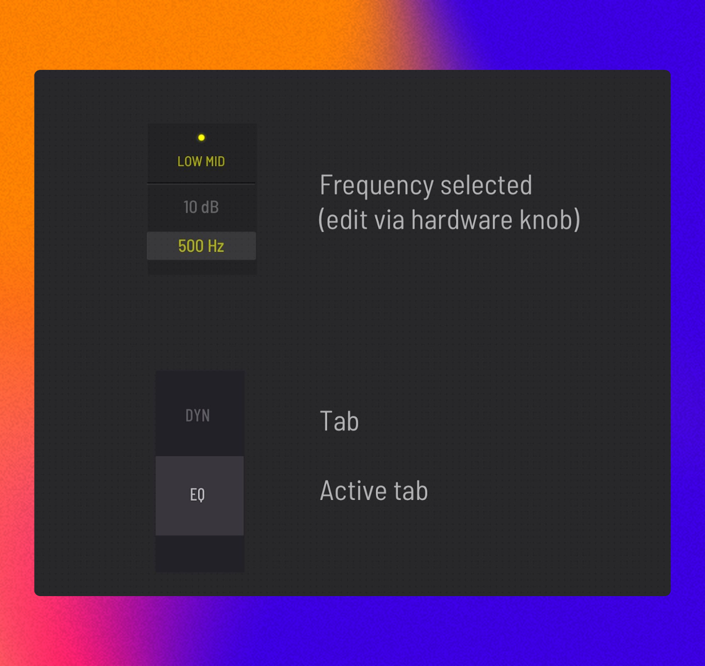
The ideation phase produced two distinct layout options, each ready for real-world testing. Our focus was on integrating clear signifiers and visual indicators to intuitively guide users when interacting with crucial controls like gain, frequency, and Q-factor.
Like a band rehearsing, we put our designs through rigorous testing, learning from every interaction.
- We conducted A/B testing to directly compare the two layout variations, carefully measuring user performance and their overall satisfaction.
- We gathered rich, qualitative feedback through hands-on usability testing sessions, allowing us to identify specific areas that needed fine-tuning.
Refining the Mix:
This testing phase provided invaluable data that led to key design refinements. Users overwhelmingly preferred Version B due to its ergonomic advantages – it simply felt more natural and comfortable to use. This feedback directly informed adjustments that significantly improved the overall interface functionality and genuinely delighted our users.
With a refined vision, we moved to create a polished, near-final version, capturing every detail of the user experience.
- I developed a high-fidelity prototype using Figma. This prototype brought key scenarios to life, showcasing how users could:
- Smoothly drag and adjust EQ parameters in real-time with precision.
- Effortlessly reset and save custom presets for quick recall.
- Seamlessly navigate across multiple audio channels, maintaining control over the entire mix.
Validating the Vision:
The high-fidelity prototype served as a crucial tool. It validated the design’s effectiveness, ensuring a seamless user experience across various complex workflows. It was also instrumental for powerful presentations to stakeholders and for final rounds of user testing, truly showcasing the transformative potential of the new interface.
The design of the Behringer X32 digital mixing console exemplifies the power of a deeply user-centered design in creating innovative solutions for complex, high-stakes systems. By zeroing in on user pain points – such as the cumbersome EQ adjustments, hidden controls, and difficult navigation between channels – and leveraging effective UX techniques like extensive user research, meticulous wireframing, interactive prototyping, and rigorous A/B testing, we not only improved the interface but also significantly enhanced the overall user experience.
The impact of our work was clear and resounding. We saw a remarkable 70% increase in user adoption rate for the new touchscreen interface, demonstrating its immediate appeal and ease of use, a metric tracked through console usage analytics. Users experienced an average 30% reduction in time on task for critical adjustments like EQ settings, directly confirmed through timed usability tests, allowing them to work faster and more intuitively during live performances. Most gratifyingly, our user satisfaction scores soared to 85%, consistently highlighted in post-launch surveys and direct feedback channels, reflecting how truly delighted users were with the intuitive layout and touch interactions. I am excited to continue exploring opportunities for innovation in the world of audio technology.
.avif)