
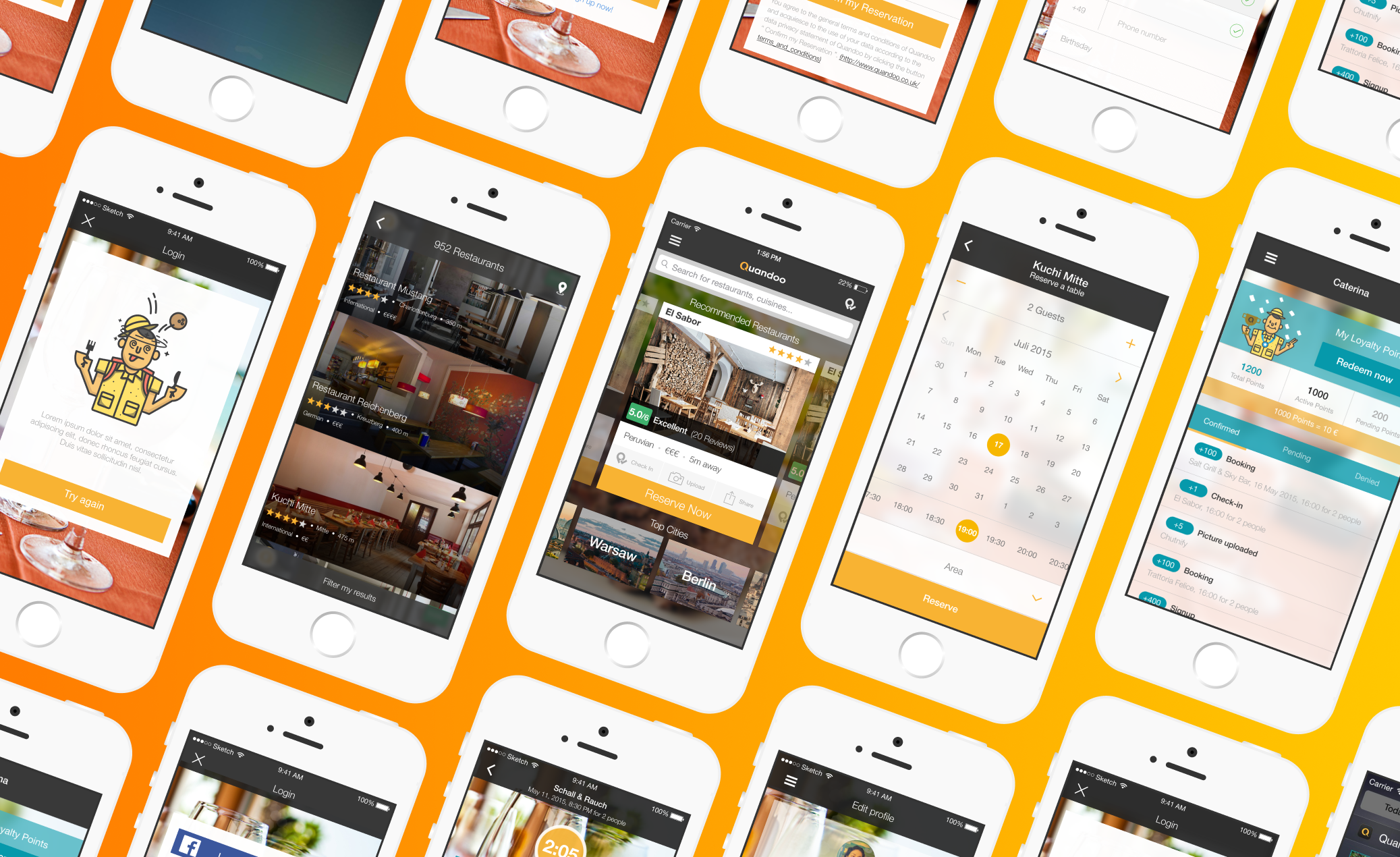
Imagine running a bustling restaurant – a symphony of delicious food, happy customers, and seamless service. But behind the scenes, managing reservations, customer interactions, and understanding your business's pulse can feel like a tangled mess. That's where the Quandoo Business Center comes in. This web application is a powerful tool built specifically for restaurant owners, designed to help them orchestrate their operations, not just manage them.
As the restaurant industry keeps evolving, so do the needs of its hardworking operators. Our goal with this redesign wasn't just to update a tool; it was to enhance the user experience and streamline workflows, all based on invaluable merchant feedback, clear business objectives, and technical realities. By truly focusing on making things easy to use and incredibly efficient, our redesign aimed to empower restaurant owners to make quick, informed decisions, ultimately boosting their day-to-day effectiveness and keeping their customers happy.
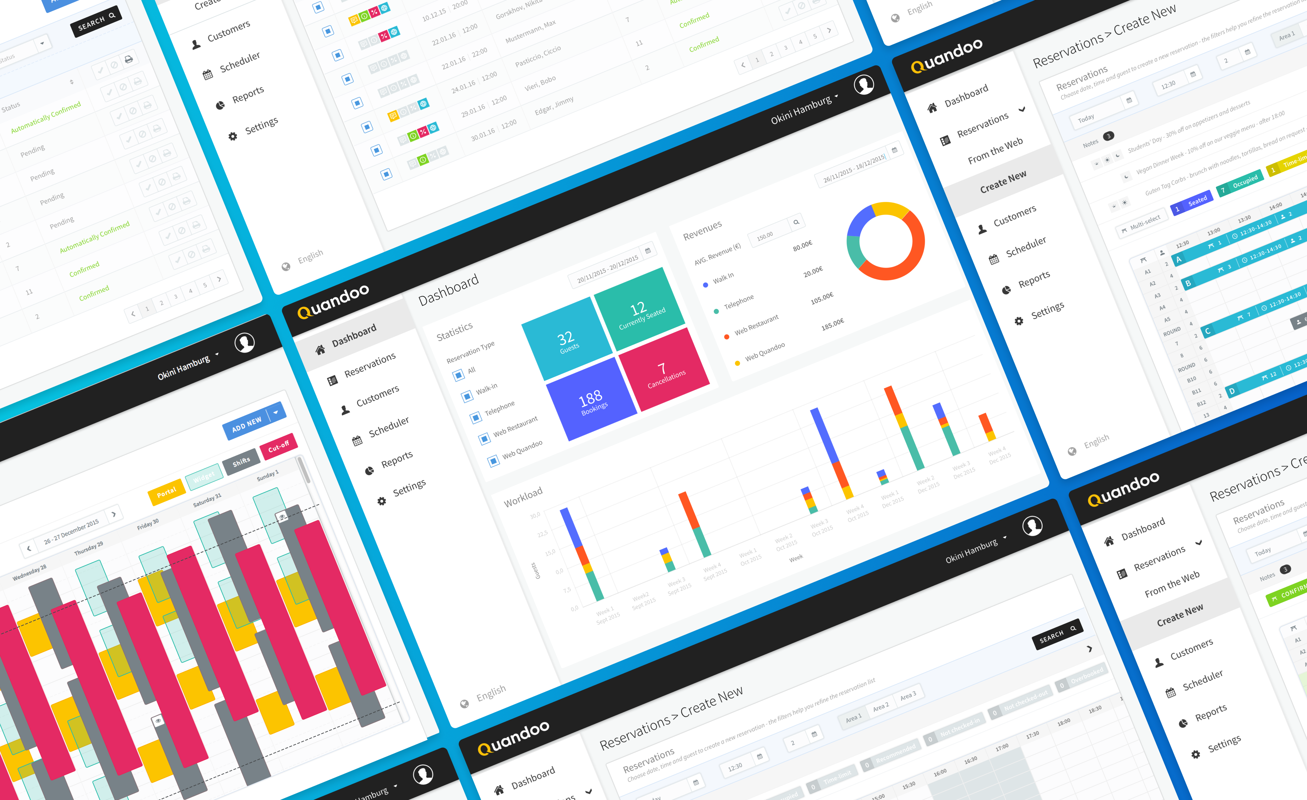
We knew the existing web app had its quirks, making it harder than it should be for restaurant owners to run their show. Our first step was to really dig into what wasn't working.
The original web app presented several hurdles that kept restaurant owners from efficiently handling their operations:
- A Tangled Web of Navigation: Users often felt lost trying to move between different parts of the app, making simple tasks feel complicated.
- Data Overload, Insight Underload: Important business metrics were buried under a mountain of information, making it tough to quickly grasp what was truly important.
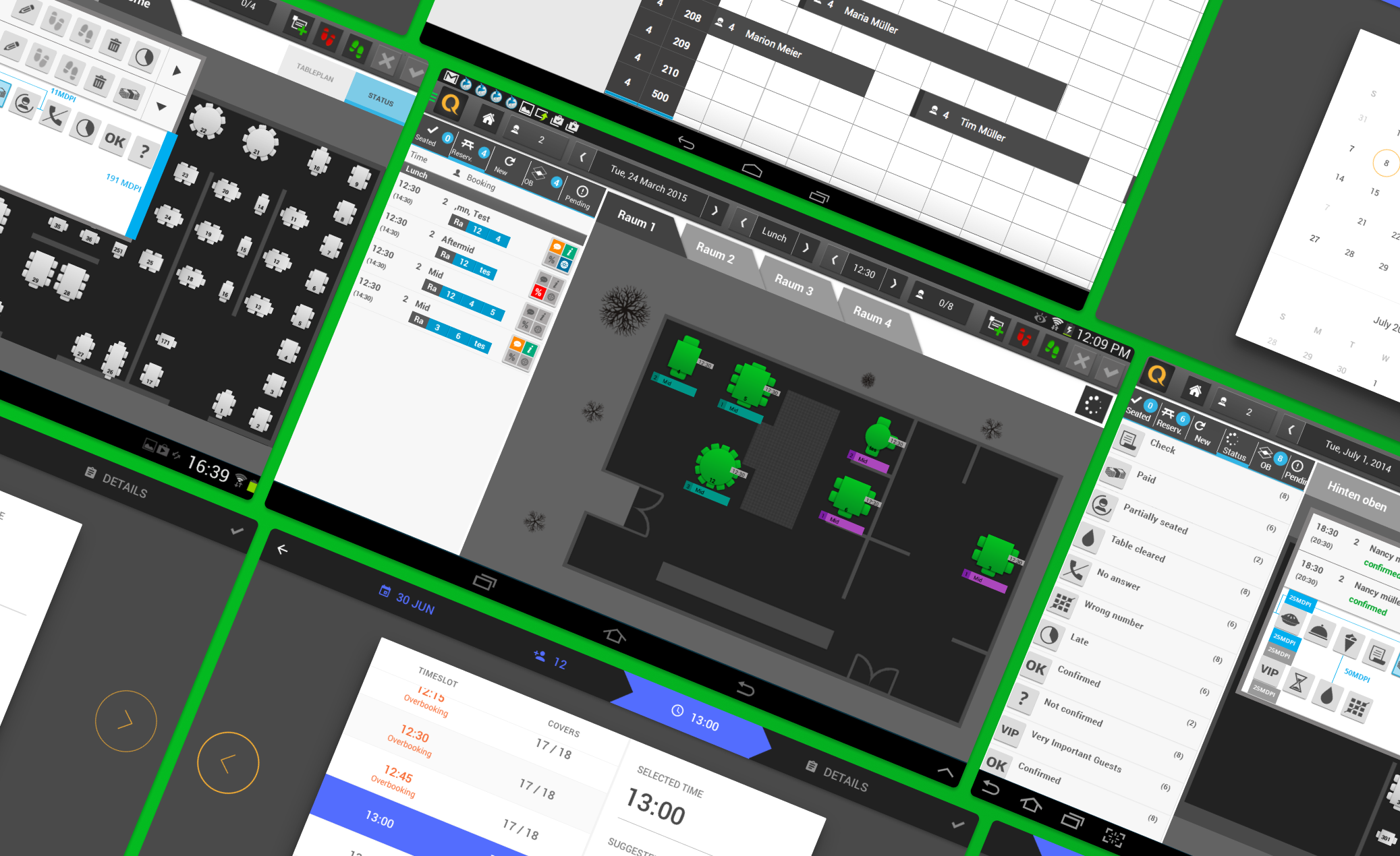
- Cluttered Reservation Chaos: The system for managing reservations felt messy and confusing, adding stress to an already busy environment.
Through conversations and observations, we clearly identified the daily pain points:
- Time Sinks: Restaurant owners told us they were spending far too much time wrestling with reservations and trying to dig up key statistics, pulling them away from focusing on their customers.
- The Frustration Factor: Confusing layouts and tricky processes often led to sighs and exasperation, impacting how they felt about the app overall.
- One-Size-Fits-None Data: Users wished for more control over how they viewed and managed their data, craving a system that could adapt to their unique needs.
To truly design a web app that resonated, we had to understand the diverse roles within a restaurant. So, we crafted three key personas to represent our users:
- The Floor Conductor (Restaurant Manager): This persona needed lightning-fast access to reservations and customer details to make on-the-spot decisions and keep service flowing smoothly.
- The Visionary Leader (Owner): Focused on the big picture, the Owner needed clear, high-level views of revenue metrics and overall performance to guide the business strategically.
- The Daily Dynamo (Staff Member): For the staff, straightforward access to daily schedules and quick customer interaction tools were essential to handle their immediate tasks without friction.
To ensure our design solutions hit the mark, we put our ideas to the test with rigorous methods.
Tools for Discovery
- Deep Dive Interviews: We held in-depth conversations with restaurant owners and staff, gathering rich, qualitative feedback about their daily struggles and what they truly wished for in the app.
- Observational Insights: We watched users interact with the existing app in real time, like detectives identifying crime scenes of confusion and frustration, helping us pinpoint exact areas for improvement.
- A/B Comparison Tests: We ran direct comparisons between different design approaches, letting data guide our decisions on which elements were truly most effective and user-friendly.
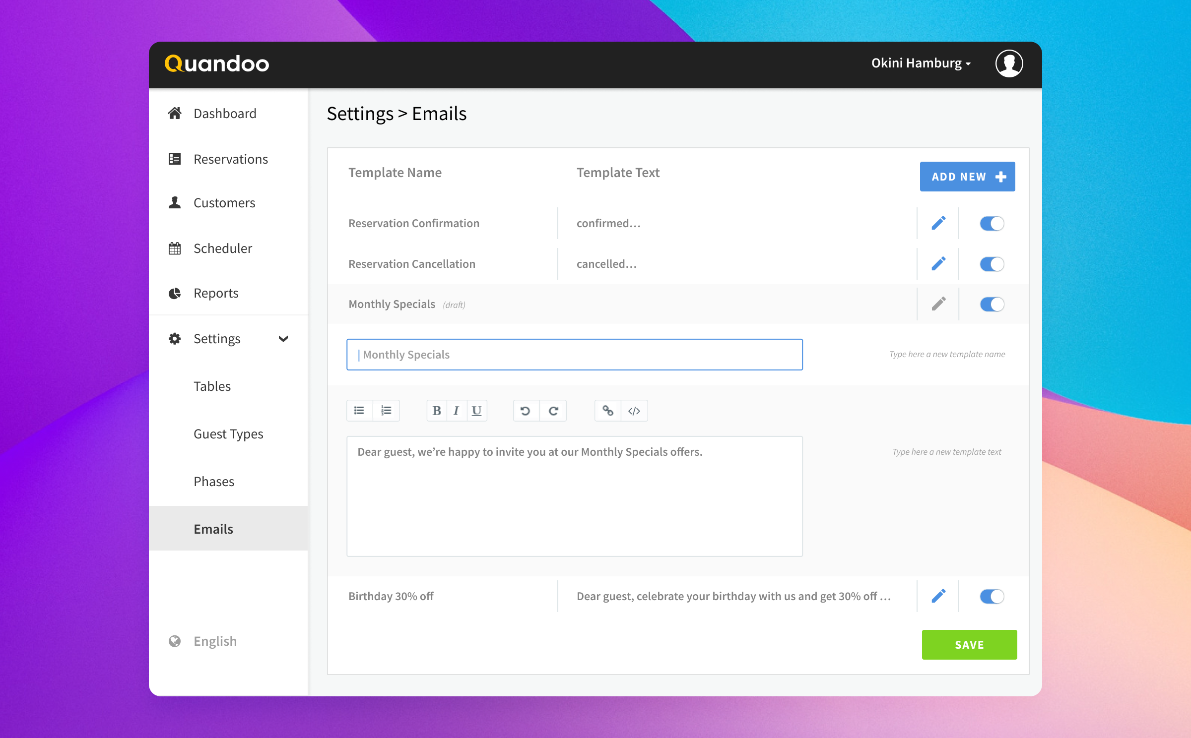
Based on all the invaluable insights we gathered, we focused on several key solutions to transform the Quandoo Business Center:
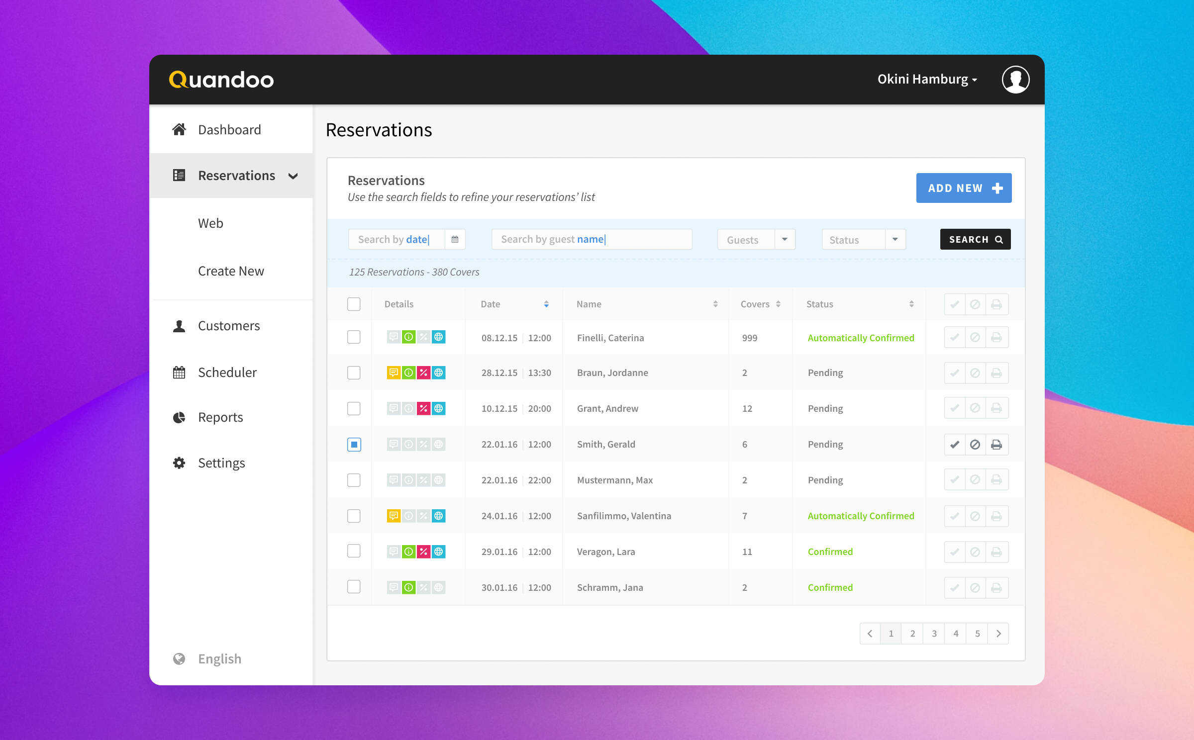
- Clearer Pathways: We simplified the navigation with a more intuitive menu structure, meaning owners and staff could get to the features they needed with significantly fewer clicks.
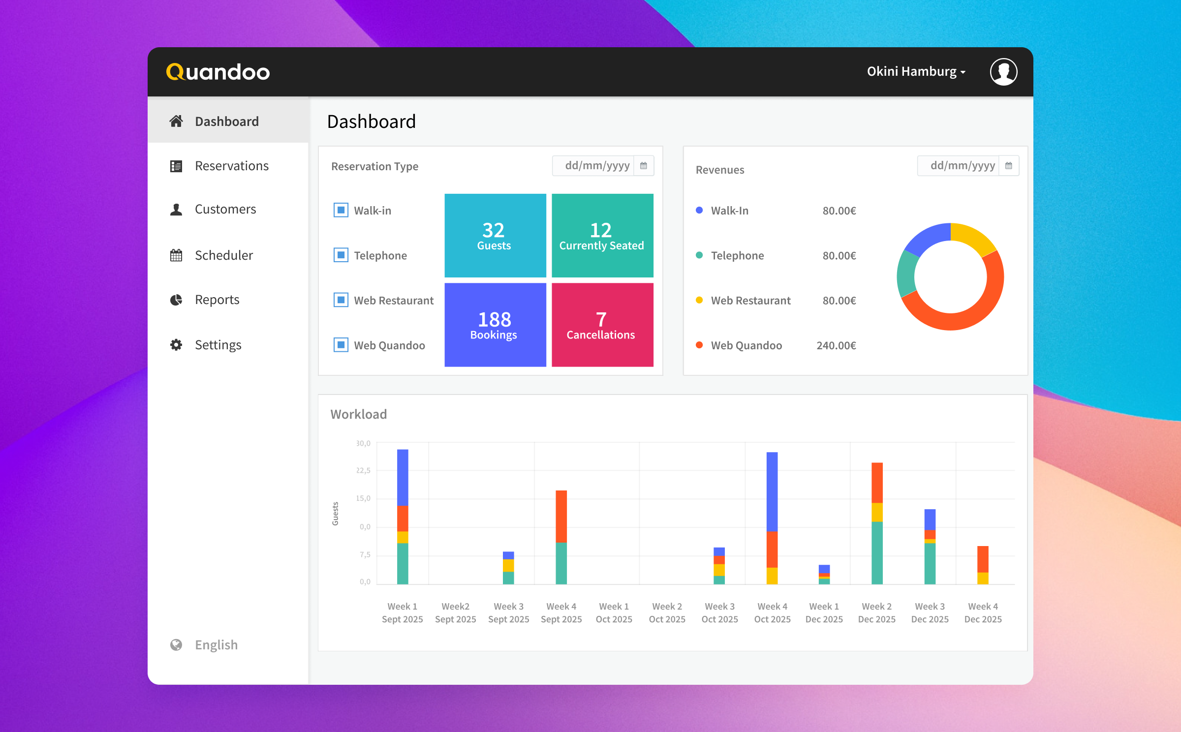
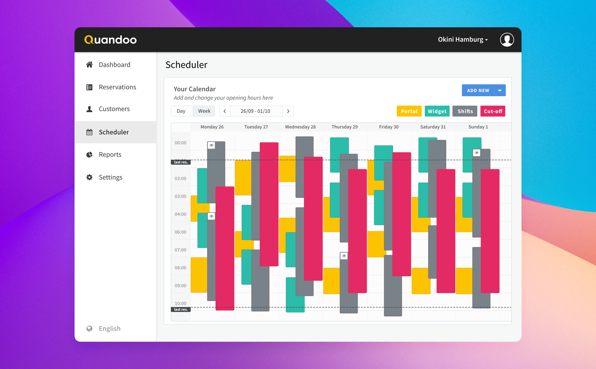
- The Insightful Dashboard: We completely redesigned the main dashboard. It now presents essential metrics at a glance, using smart color coding and crystal-clear graphs to make complex data easy to understand and act upon.
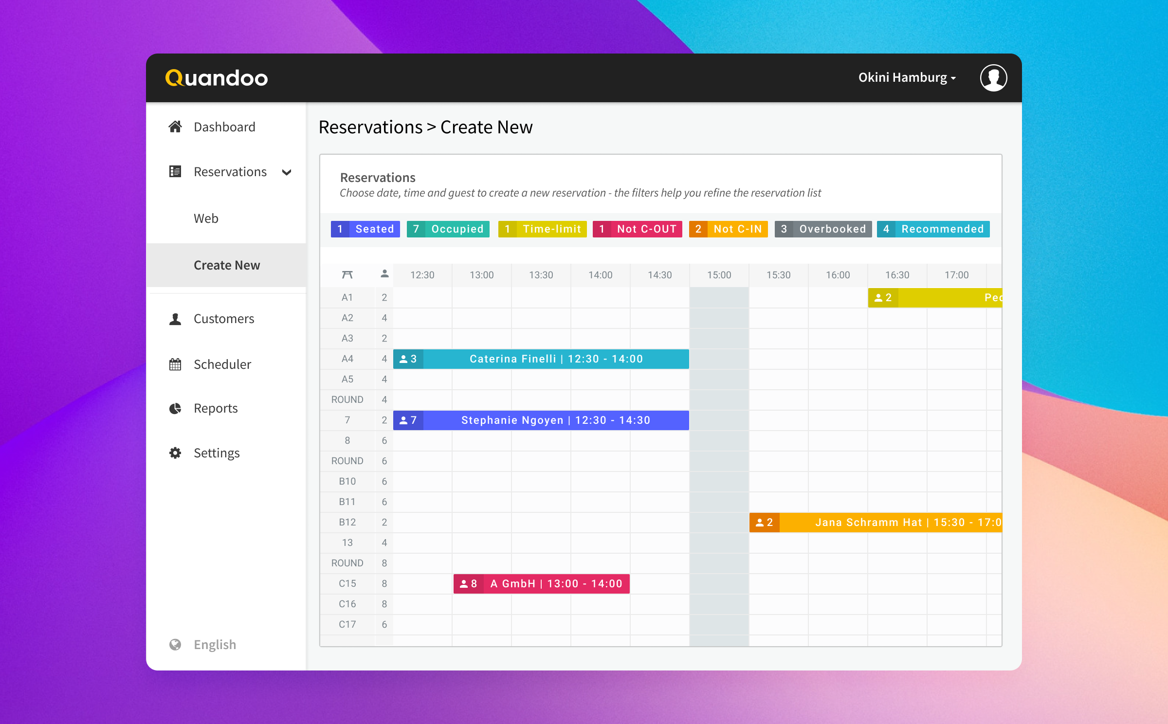
- Effortless Reservation Flow: The reservation system got a complete overhaul! We introduced a fluid, drag-and-drop calendar interface that made creating and managing bookings incredibly intuitive and efficient.
This redesign journey really cemented how vital user feedback is to creating something truly impactful. Building continuous feedback loops into our process was like fine-tuning an instrument – each iteration made the user interface more harmonious. By truly embracing a user-centric approach, prioritizing the needs and preferences of our restaurant partners, we achieved outcomes that were both effective and genuinely satisfying. And, of course, close collaboration with all stakeholders ensured that our business goals were perfectly aligned with what our users needed, creating a beautiful balance between functionality and ease of use.
The impact of our work was clear in the numbers. We saw a remarkable 15% increase in bookings, a direct result of the more intuitive and efficient reservation management system, which we tracked through internal booking data. Restaurant owners experienced a 30% improvement in time efficiency when managing their operations, a metric we largely confirmed through user surveys and timed task analysis during usability sessions. Most gratifyingly, our user satisfaction scores jumped by 40%, consistently highlighted in post-redesign user interviews and satisfaction surveys.
This experience was a powerful reminder of empathy's role in design, reinforcing that truly understanding your users is the secret to building successful products.

.avif)