
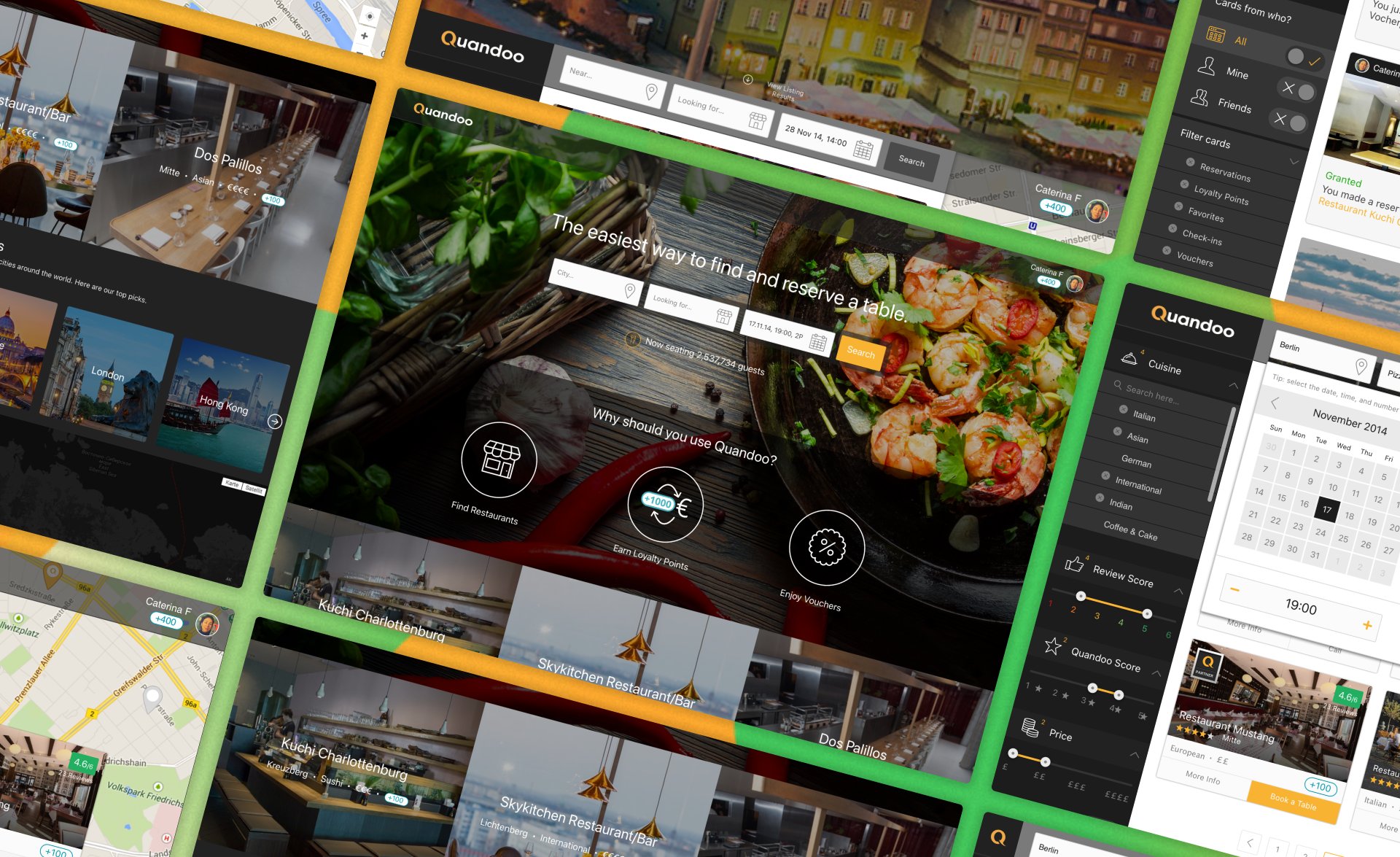
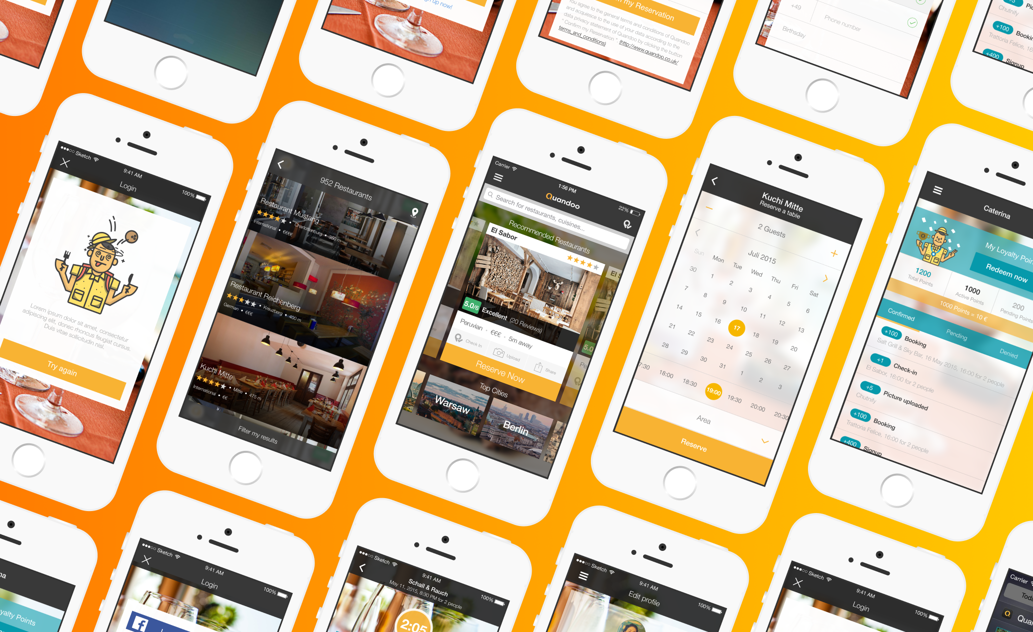
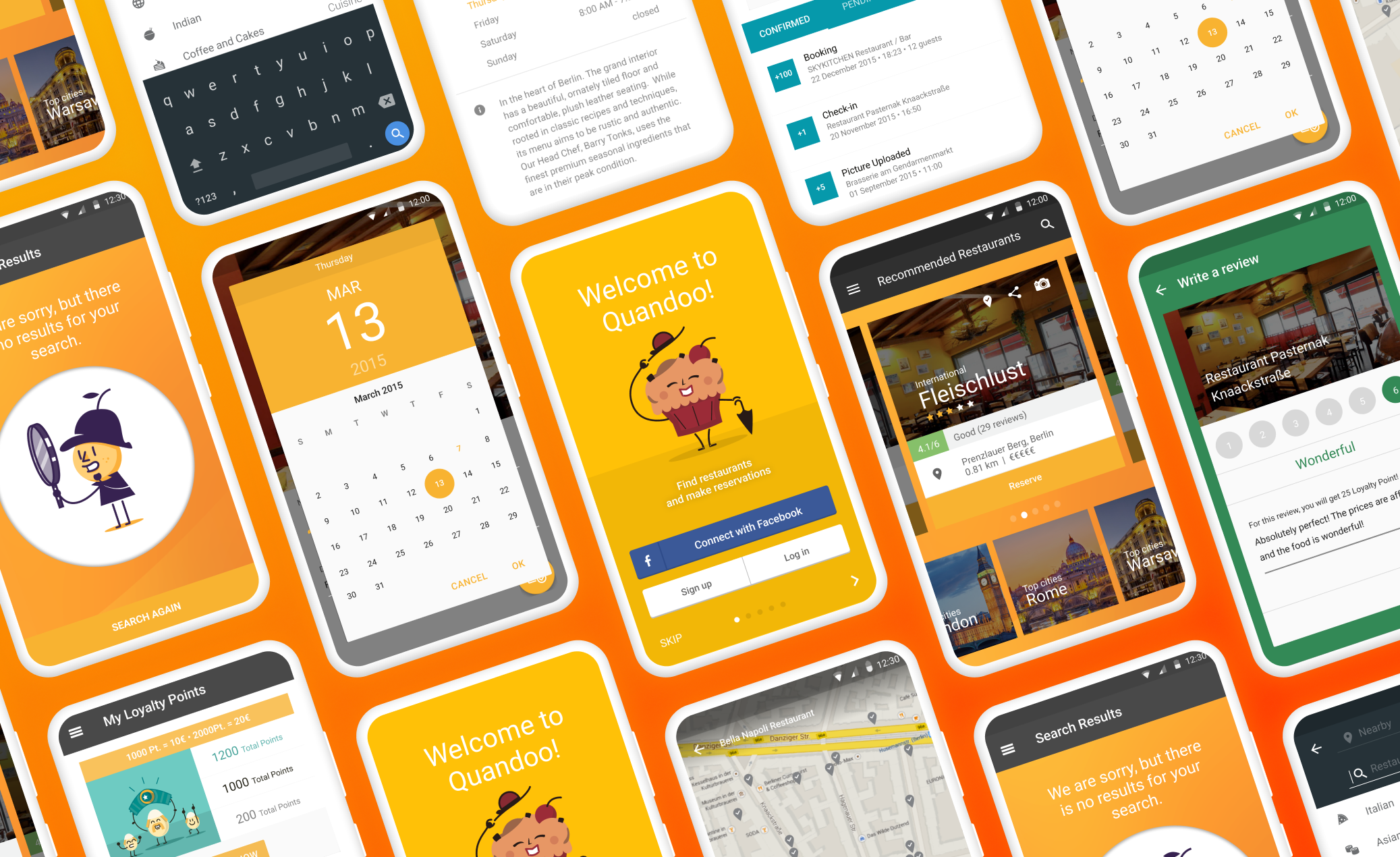
Imagine a vibrant digital marketplace where diners effortlessly connect with their next culinary adventure. That's the essence of Quandoo – a platform designed to bridge the gap between hungry patrons and incredible restaurants. While our Android app for diners already existed, I spearheaded the charge to take it to the next level. This wasn't about building from scratch; it was about refining, enhancing, and innovating the existing foundation to truly empower restaurant owners and elevate the diner experience.
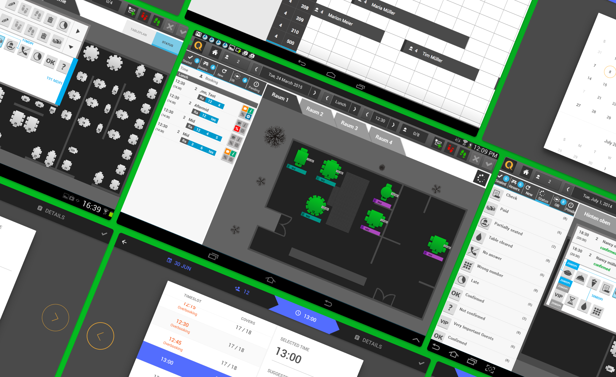
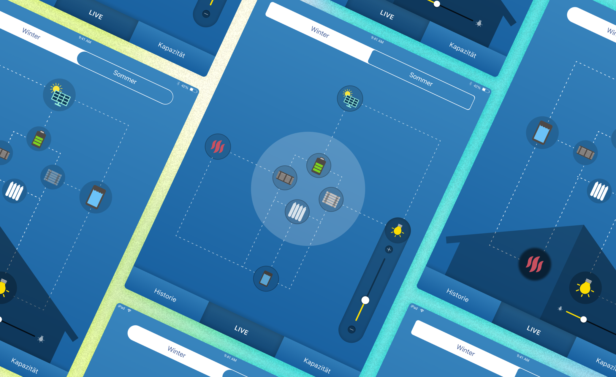
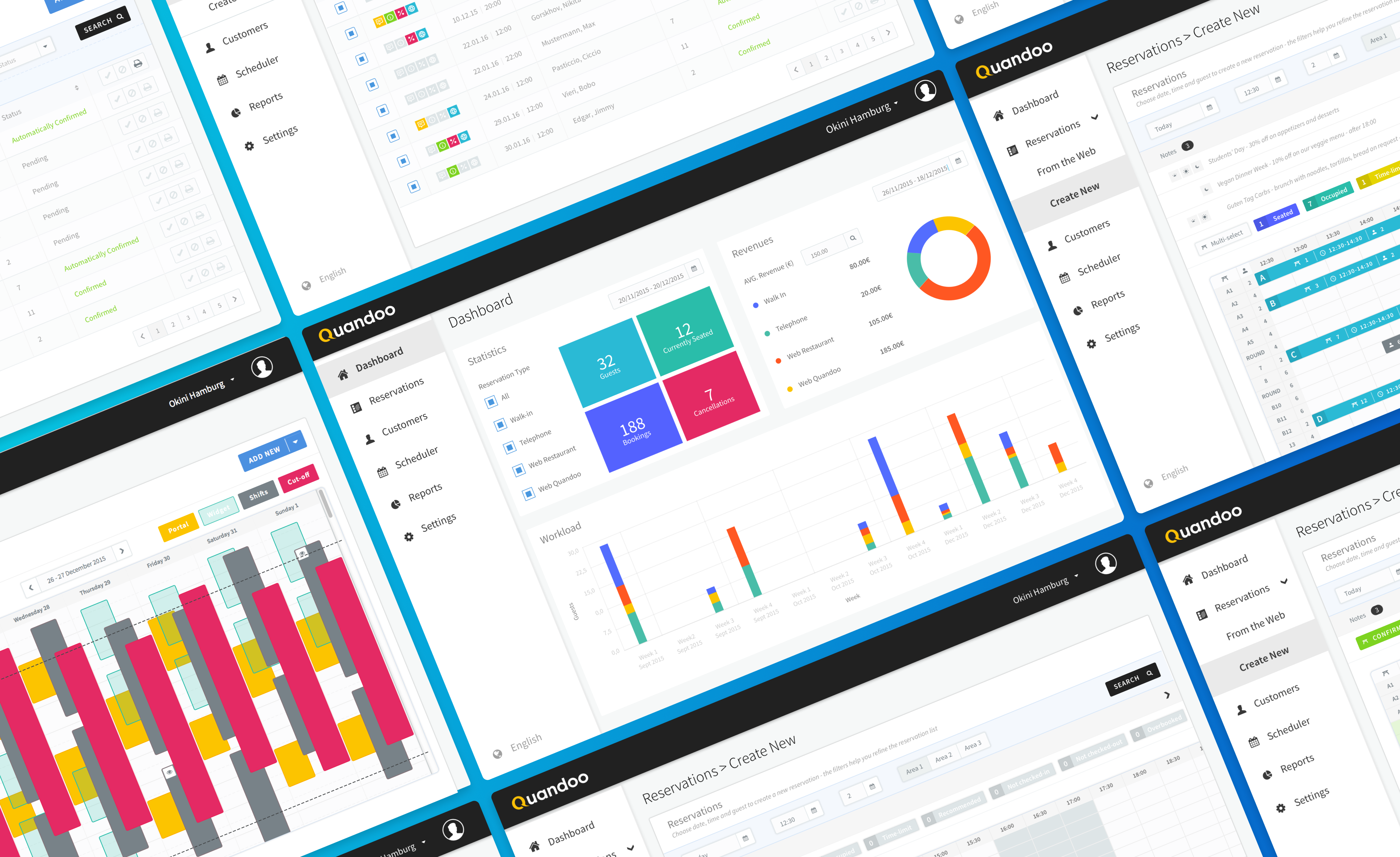
My goal was to refresh and expand the Quandoo Merchant App for Android, ensuring it not only met the rigorous standards of Android Design but also leveraged cutting-edge techniques like 9-patch scaling for flawless visuals across countless devices. We aimed to create a tablet application tailored specifically for restaurant owners, enabling them to seamlessly manage reservations, customer interactions, and operational statistics. Our goal was to create a user-centric design that welcomed all, streamline the booking process to make it incredibly quick, create a visually stunning app that truly reflected our brand, and guarantee accessibility for every user.
Crucially, our target audience for this app presented unique and fascinating challenges. We were designing for a diverse group of restaurant owners and staff who were often not digital natives, meaning intuitive and forgiving design was paramount. They were also incredibly busy in real-time scenarios, juggling orders, customers, and staff, so any solution had to be lightning-fast and require minimal cognitive load. Furthermore, this audience was very diverse in terms of mother tongue, age, nationality, and ability, making accessibility not just a feature, but a foundational principle of our design approach.
To truly enhance the app, we first needed to understand its current currents and hidden depths. This meant embarking on a journey of discovery.
To pinpoint areas for improvement, we launched extensive user surveys and interviews, alongside deep discussions with our incredible restaurant partners. The feedback was a compass, pointing to key areas of friction:
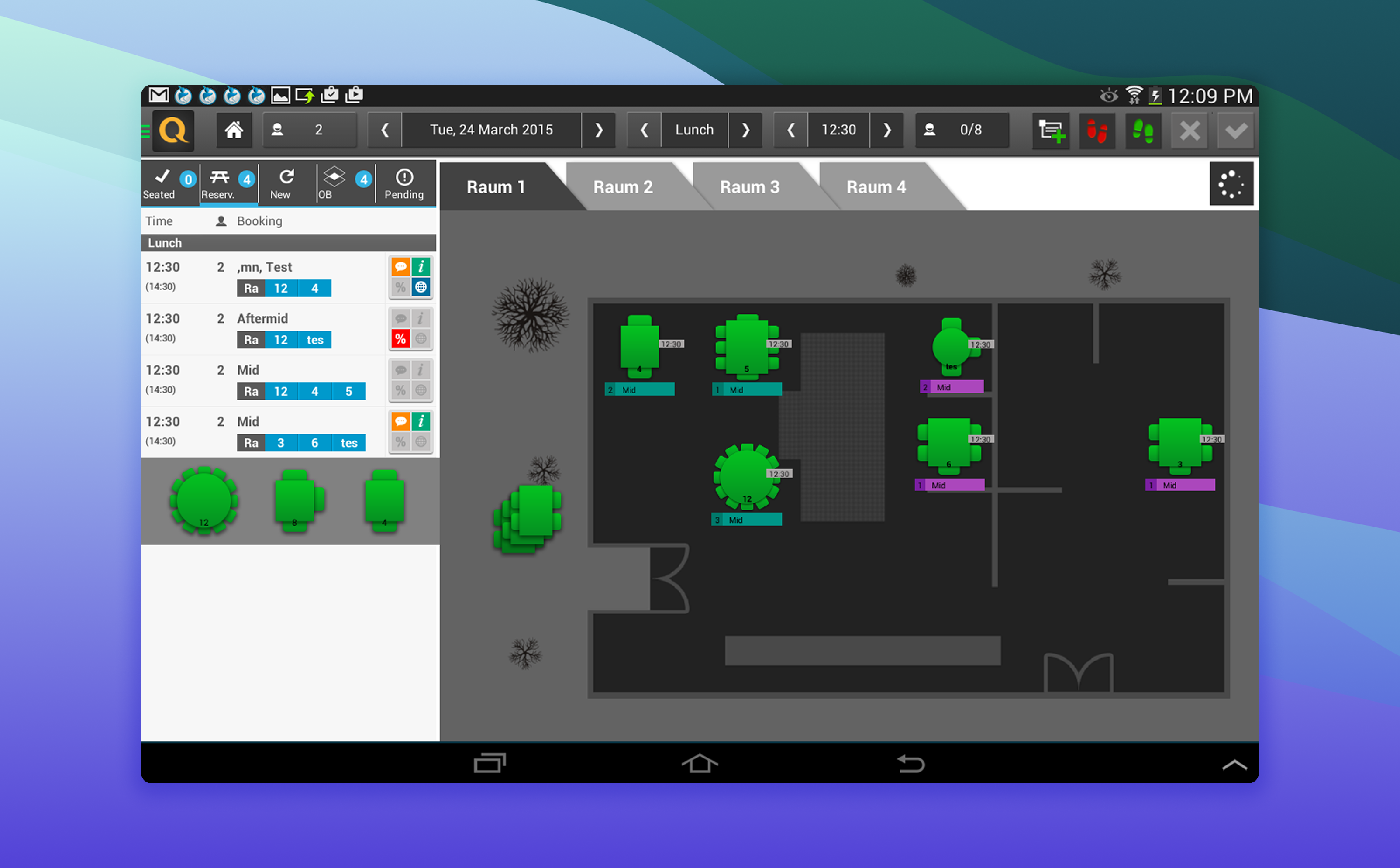
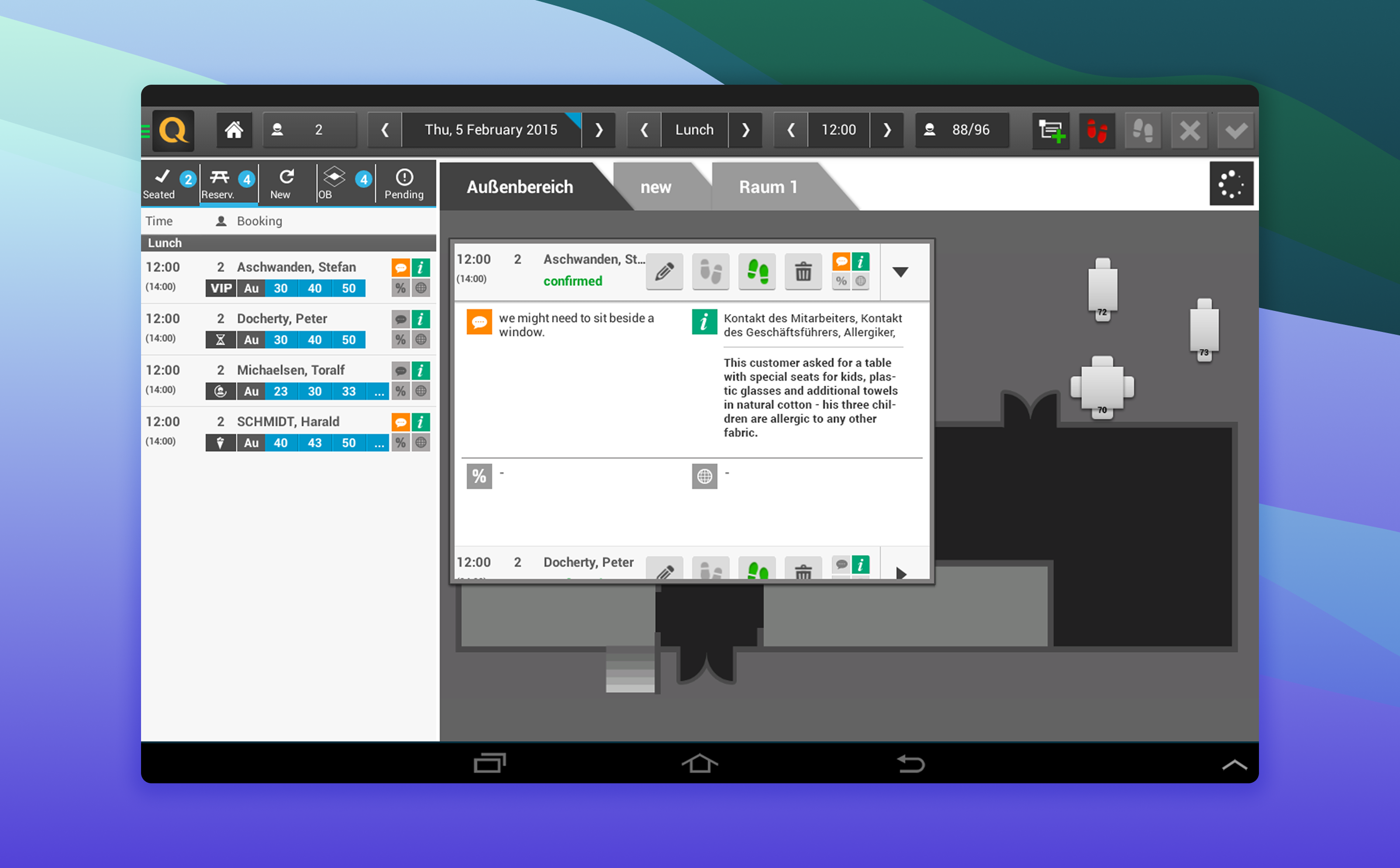
- Floor' Dilemma: Users often found the app's navigation confusing, leading to frustration when trying to assign custumers to a table.
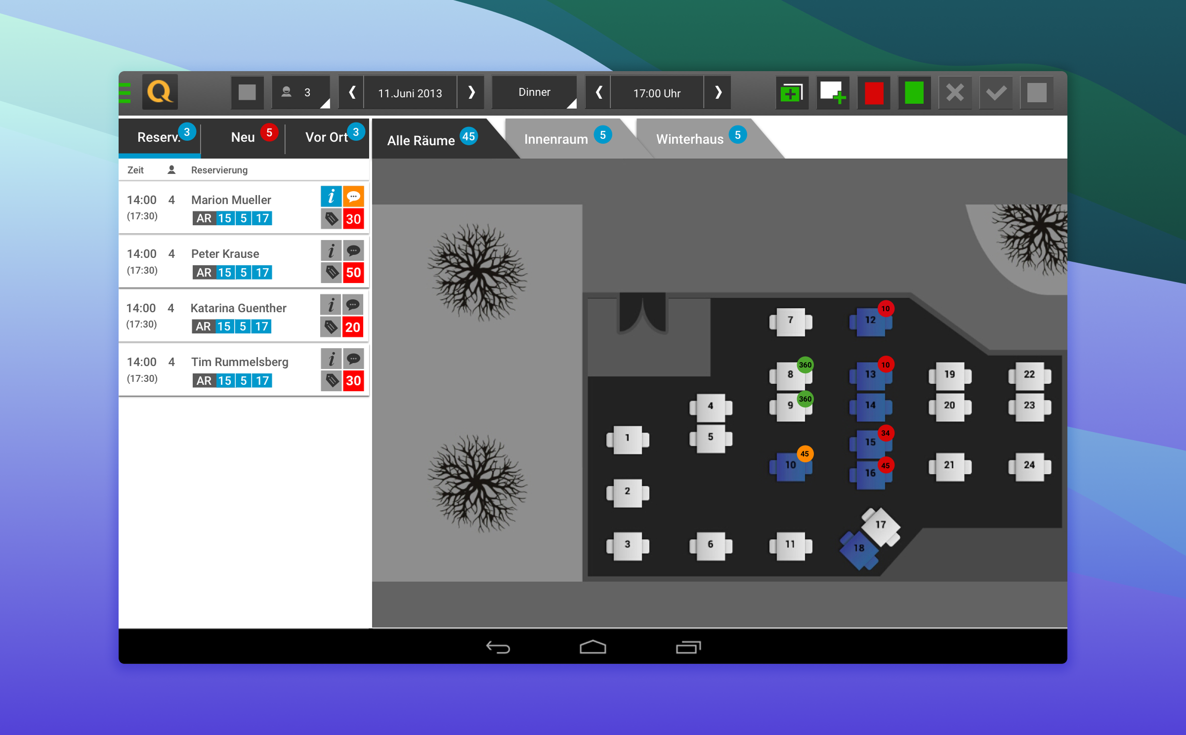
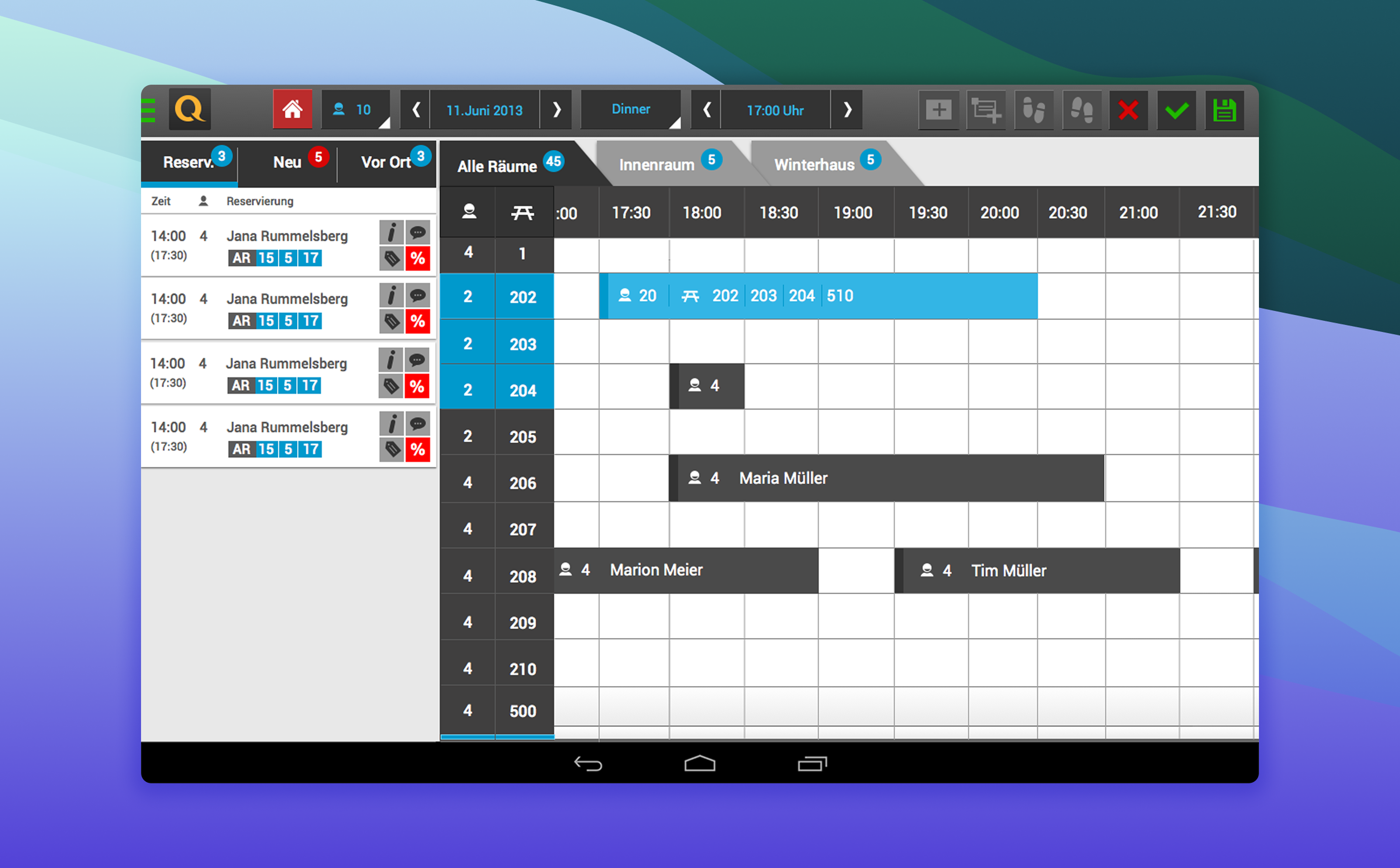
- Merchants' Missing Spotlight: Our restaurant partners expressed a strong need for better visibility of their floorplan status and clearer insights into their real-time bookings.
- A Craving for Automation: Users yearned for more automated recommendations and simpler access to allocate the incoming reservations to the right set of time/tables.
Navigating the Competition: A Market Scan
We also conducted a thorough competitive analysis, like scouting the horizon to see how other apps were tackling similar challenges. This exploration provided invaluable insights into industry best practices and innovative features that could truly elevate our app.
Forging the Path: Ideas & Blueprints
Armed with this priceless data, we gathered for energetic brainstorming sessions to generate a wealth of ideas for new features and improvements. We then sketched out our proposed changes using low-fidelity wireframes, essentially creating visual blueprints. Crucially, we conducted usability testing with merchants at this stage. Their invaluable feedback helped us refine our designs before moving on to polished, high-fidelity prototypes.
Based on everything we learned from our research and testing, here’s how we transformed the Quandoo Merchant App for Android:
- Effortless Pathways: To conquer navigation woes, we completely reimagined the app's layout. We introduced an intuitive menu, providing instant access to essential sections like Home, Search, Bookings, and Profile. This dramatically simplified the user journey.
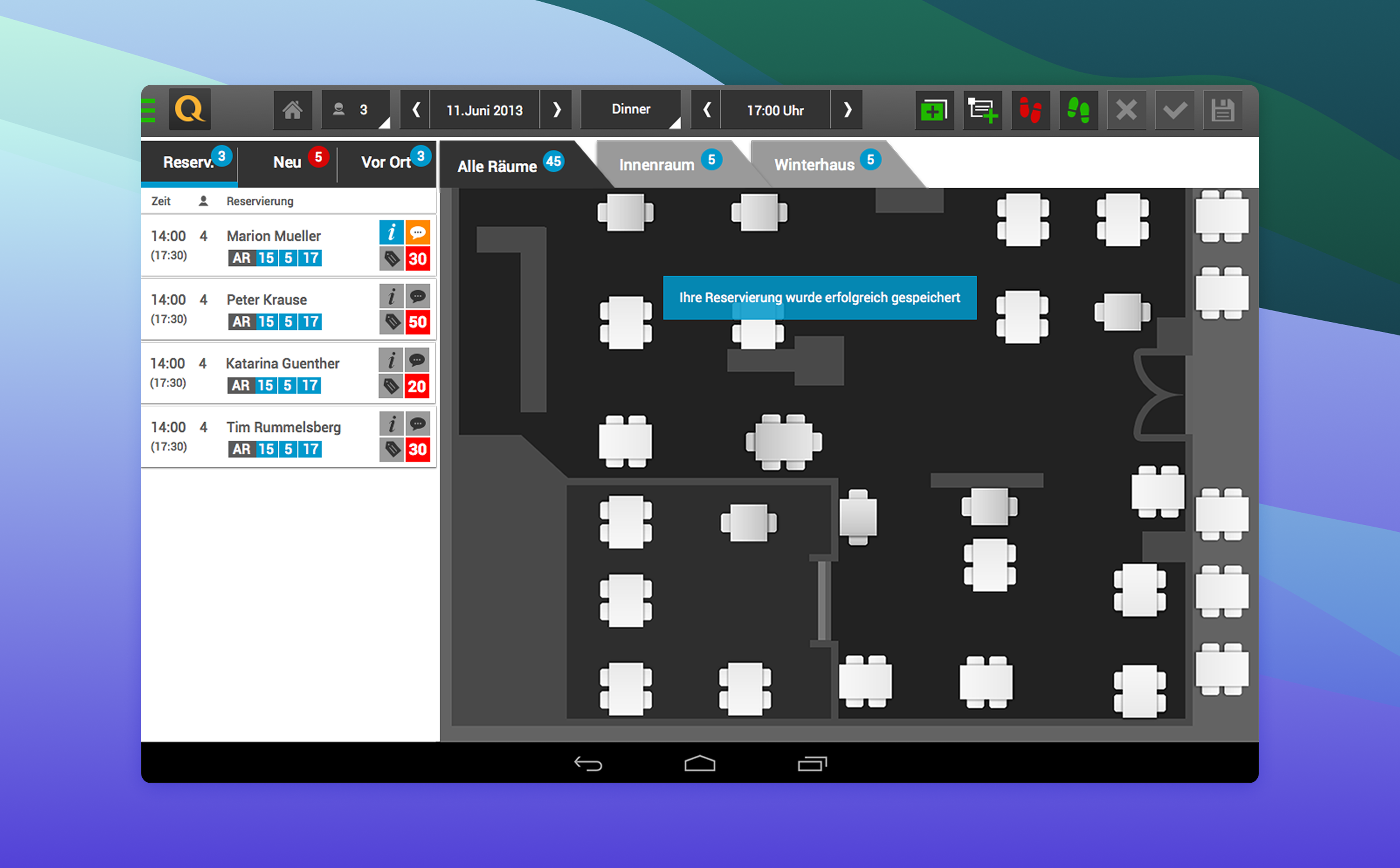
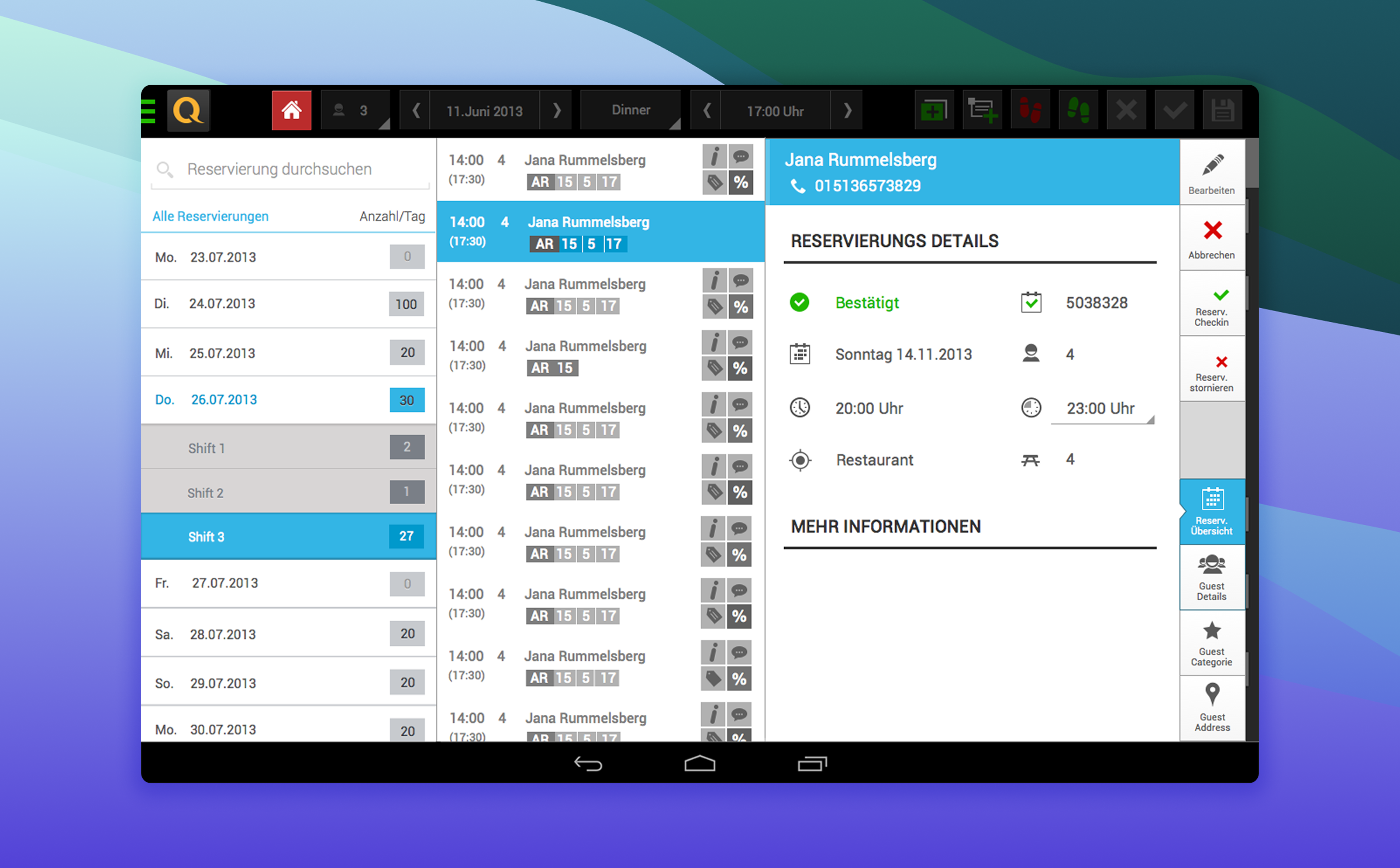
- Booking Bliss: We drastically streamlined the booking flow by reducing the number of steps required to finalize a reservation. For recurring users with saved profiles, we even added a one-click booking option, making the process incredibly fast and smooth.
The implementation of these design solutions led to truly notable improvements in user satisfaction and engagement across the board. Post-launch surveys painted a clear picture of success:
- A whopping 80% of users found the app easier to navigate, thanks to our simplified layout.
- The average time to create and manage a new reservation plummeted by 35%, a direct win for our streamlined booking process.
We observed a significant increase in merchant satisfaction, with many restaurant owners leaving positive reviews on Google Play Store after the release of our new features.
This project was a powerful reminder that continuous listening and iterative design are the pillars of creating a truly impactful product. It underscored the importance of adapting to feedback and consistently refining the user experience.

.avif)